Gantt View Pro Documentation
1. FAQ
-
Question: Do we need to purchase a new version of Gantt View Pro when updating to a new Odoo Version?
Answer: Yes, when you migrate to a new version of Odoo you need to purchase Gantt View Pro for that version.
-
Question: Can we get a discount for Gantt View Pro?
Answer: No, there are no discounts available for the Gantt View Pro.
-
Question: Can we get a discount for Gantt View Pro when we already bought it for a different version?
Answer: No, there is no discount available when you want to purchase it for a different version of Odoo.
-
Question: How can we purchase Gantt View Pro?
Answer: You purchase Gantt View Pro through the Odoo App Store.
2. Installing Bryntum Gantt View Pro
2.1 Enterprise Edition
-
After you've purchased the module through the account you use for Odoo, login to your Odoo instance as administrator and activate Developer Mode. (Activate Developer Mode by going to Settings - General Settings - and clicking 'Activate Developer Mode' at the bottom).
-
Go to the Apps module. At the top, click on 'Update Apps List'.
-
Search for Gantt View Pro, and click 'Install'.
2.2 Community Edition
-
After you've purchased the module through the account you use for Odoo, navigate to My Account – Sale Orders – SOxxxx/xxxxxxx, corresponding with the sale order number of the Gantt View Pro purchase.
-
Click ‘Download’ underneath the SO, the version you purchased will appear, click on it and it will be downloaded.
-
Add it to your Odoo addons folder. Afterward, login to your Odoo server as administrator, activate 'Developer Mode' by going to Settings - General Settings - and clicking 'Activate Developer Mode' at the bottom. Go to the Apps module. Update the list by clicking on the "Update Apps List" link. Now install the module by clicking on the install button.
2.3 Odoo.sh
For a great explanation on how to install the module for Odoo.sh, check out this link.
3. Using Gantt View Pro
3.1 How to get to Gantt View Pro
There are two ways of getting into the Gantt View:
1. By clicking on Gantt View Pro when in the Project module.
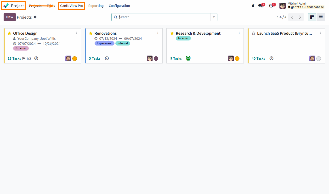
2. By clicking on the Gantt View Pro icon on the right side, when in a project.

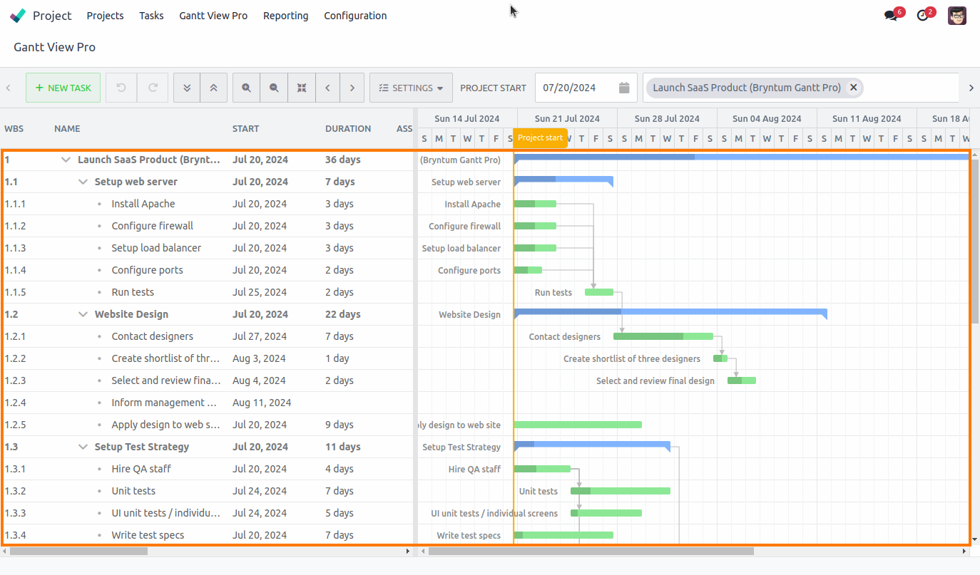
3.2 Gantt View lay-out
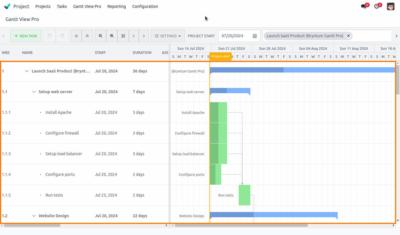
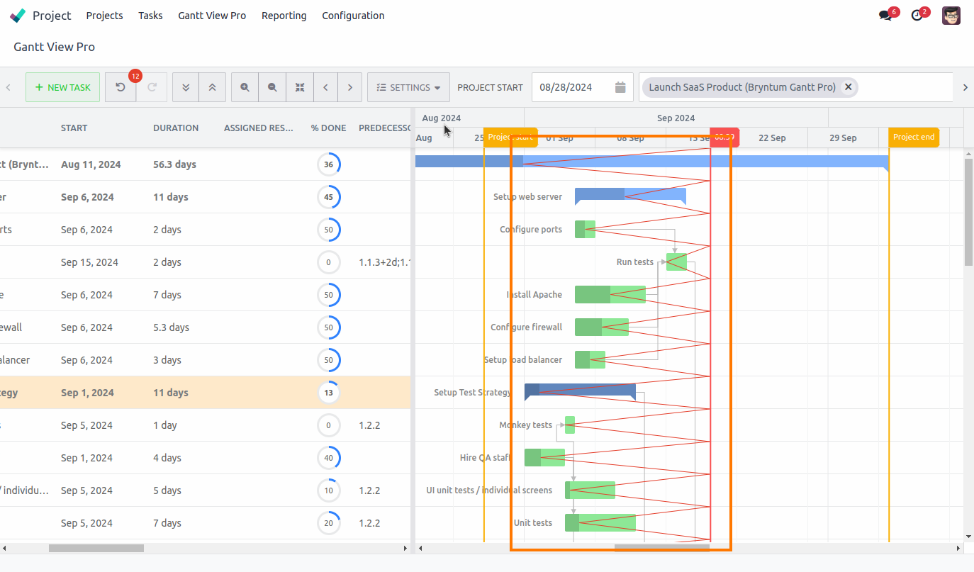
The Bryntum Gantt View consists of two different sides: the grid and the timeline.
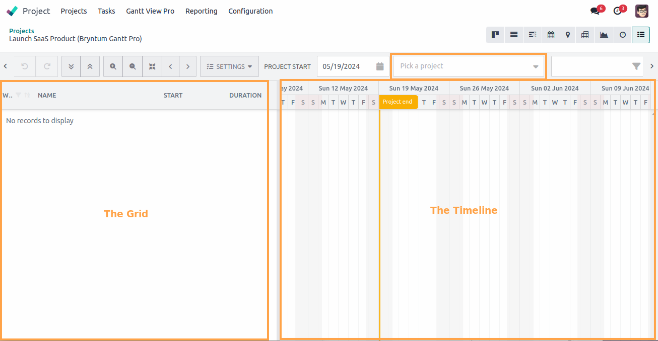
On the left side is the grid. There, columns display (editable) information about the project or tasks, once you've opened one. For more on Columns head to the Columns section.
The timeline is on the right. It will contain the visual representation of the tasks and where they occur in the set timeline of the project, when you've opened a project.
A project can be loaded from the 'Pick a project' section in the bar above the grid and timeline. Its contents will appear below. As many projects as you desire can be chosen and loaded all in the same view. They will appear below each other in the order you select them. Head to section Select project for more information on this.
3.3 The bar
The bar above the grid and timeline contains many different features you can use to your advantage and ease of use of the Gantt and it's content. Here's a rundown of the icons, what they do, and how they work.
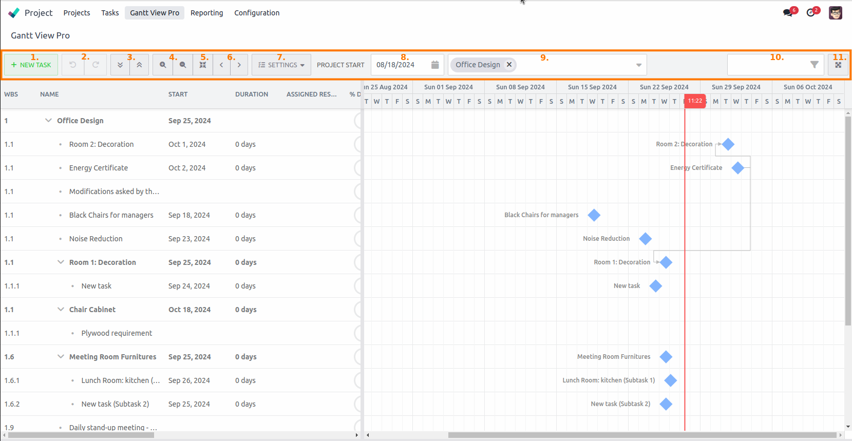
3.3.1 Create new task

When you're in the Gantt, and have loaded a project, you can create a new task at any point by clicking ‘+ NEW TASK’. It will create a task underneath the task or project you're currently on.
Continue clicking on the button, and it will create a new task as a subtask of the previous task. E.g. 1.1, 1.1.1, 1.1.1.1, etc.
If you prefer a task to be a follow-up of 1, instead of a subtask of it. E.g 1.2, 1.3, 2.0, etc., there are a couple of ways to achieve this:
- You can drag a task up over the task above it in the grid.
- Right-click on a task and select ‘Outdent’ (for more information see the Indent/Outdent section).
- Select the project first, then press ‘+ NEW TASK’.
3.3.2 Undo/redo action

These buttons undo or redo your last action(s).
When a mistake is made this allows you to easily correct it. Or, if you want to experiment with tasks in timeline, this feature allows you to go back and forth between the decisions you're trying to make.
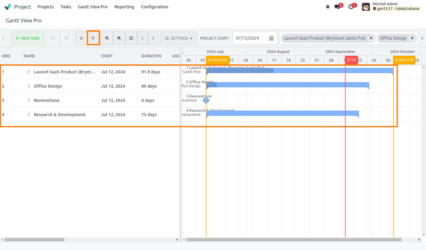
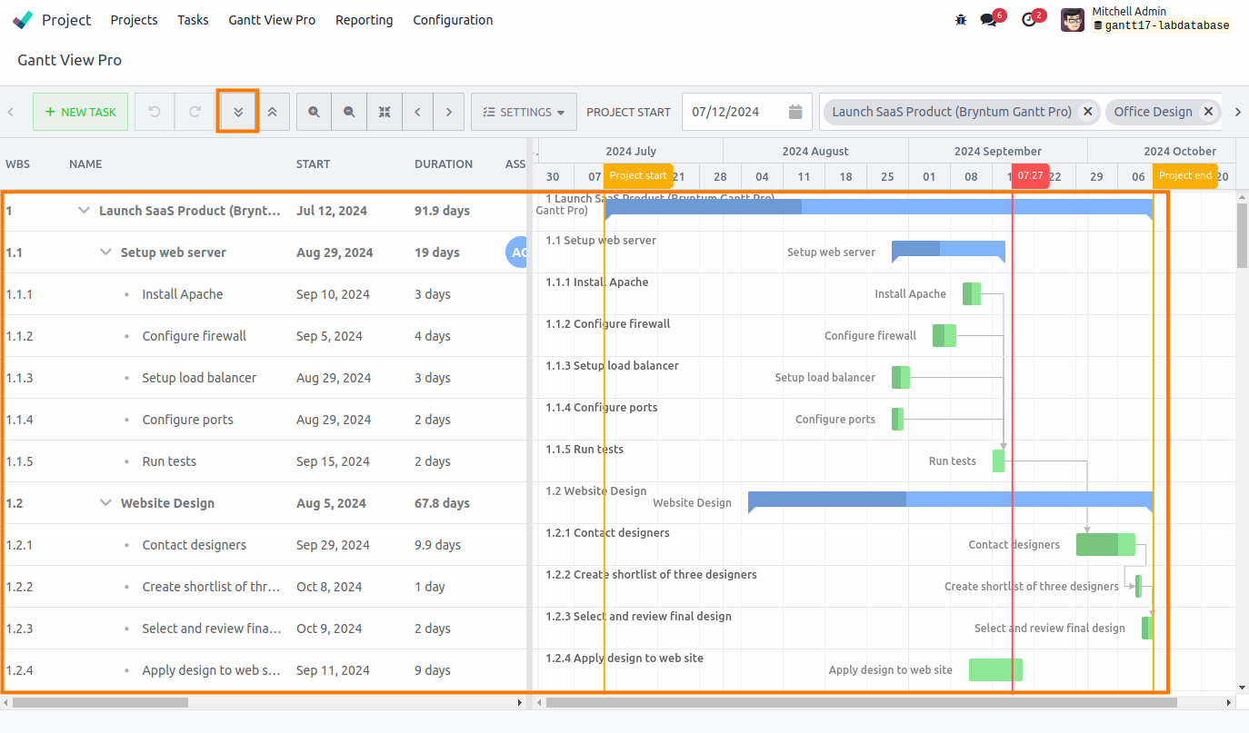
3.3.3 Expand/collapse

These buttons expand or collapse all open projects.
Having a lot of projects open can cause the Gantt to feel crowded. The expand and collapse all buttons allow you to quickly switch between an overview of all the open projects with all the tasks collapsed inside them, and expanding them again when you're ready to delve deeper into project's tasks again.
3.3.4 Zoom in/out

These buttons allow you to zoom in or out of the timeline, going from years, to quarters, to months, to weeks, to days, to hours, to quarters of hours, to five minute intervals.
It gives you very precise control from when you'd like a task to start, to a birds-eye overview of projects that last a year or longer.
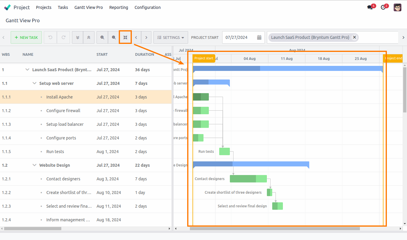
3.3.5 Zoom to fit

This button automatically fits open projects in one view on the timeline.
A very handy feature when you're working on a very zoomed in, or zoomed out, view of the timeline and need overview quickly. It instantly snaps you back to a view that fits your project in the timeline.
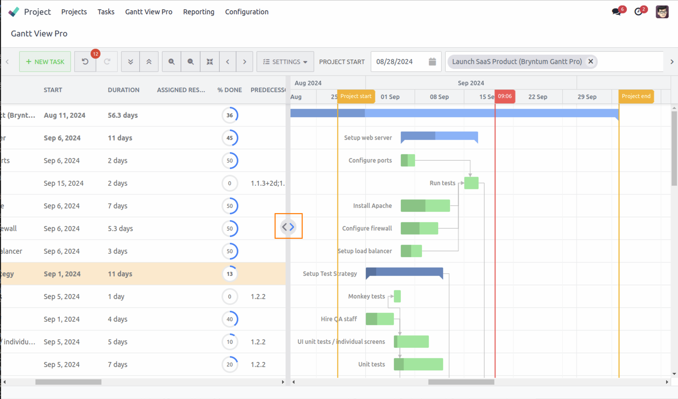
3.3.6 Previous/next time span

These buttons assist you in skipping ahead or back along the timeline in relation to the timespan you're currently viewing the timeline.
When you're viewing on a level where months are visible, it will skip forward or backward a month. If you're on the level of weeks, it will skip forward or backward a week, and so on.
3.3.7 Settings

This button contains the UI and visual features for the timeline view and allows you to toggle them. Head to the Settings Tab and UI section to learn more about all its features.
3.3.8 Project start date

Project information isn't editable from within the Gantt, except for the start date of a project in this field. The 'Project start' field allows you to change the date of when a project is supposed to start. This can be a few days from now, a few months earlier, or a year from now.
All tasks within the project will automatically adjust with the date you set in relation to the planning and dependencies you've set on them. It gives you great flexibility so you can swiftly adjust to changes in planning, when needed.
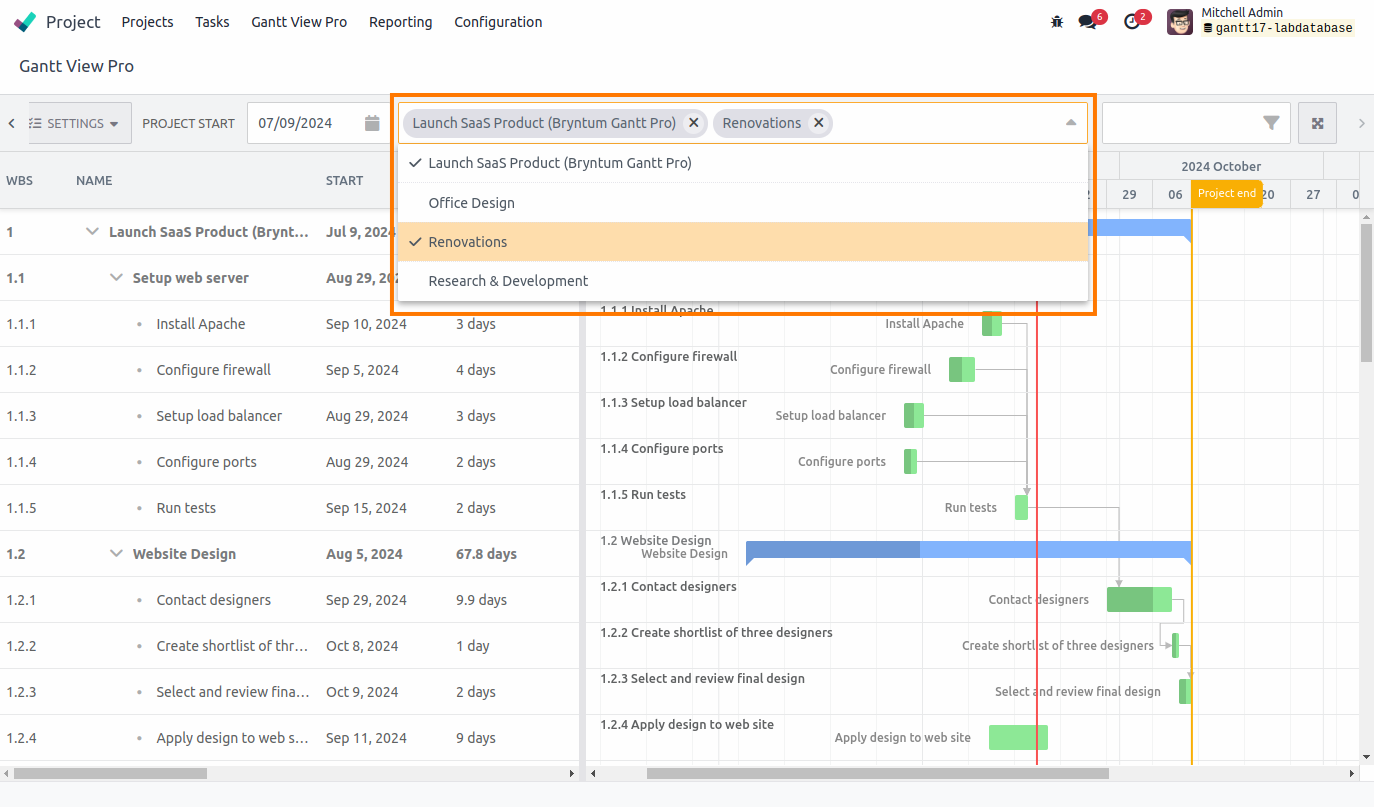
3.3.9 Select project

This field allows you to select one or multiple projects and load them in Gantt View Pro.
When you click on the arrow on the right side in the field, it shows all the projects that have been created in the Project module. You can select one, or load multiple, depending on your need.
If you don't need a particular project anymore, simply press the (x) on the right side of each project name, and it will be taken out of the Gantt View. There's no need to worry about any changes you made, they're saved automatically to the project and will appear as you left it upon loading the project again.
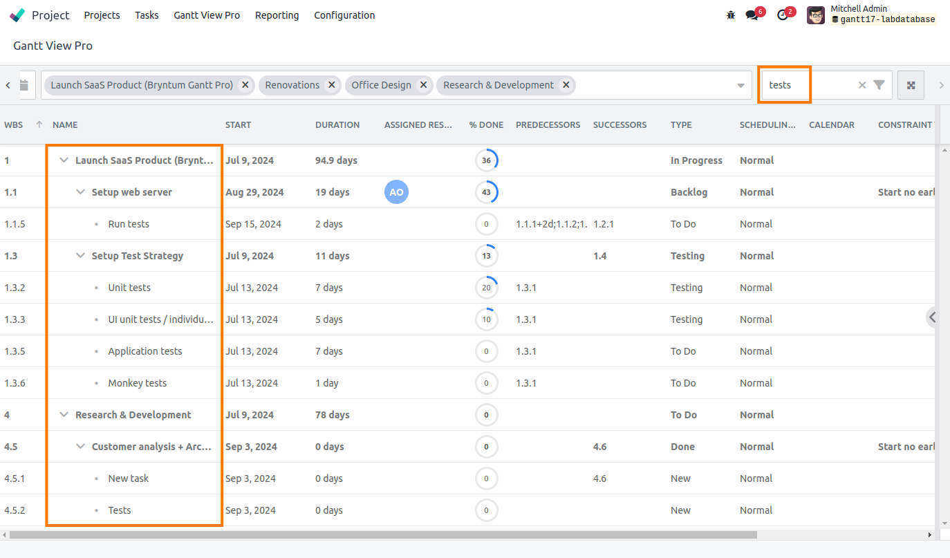
3.3.10 Search tasks

This field allows you to search for tasks in the projects that are open.
When you have one or more projects open, the ability to quickly search for a particular, or multiple tasks with the same word, is essential. The search bar allows you to do just that quickly and easily.
For example, type 'Test'. Once your results are up, you can edit, drag, delete, copy, paste, etc. any of them as desired.
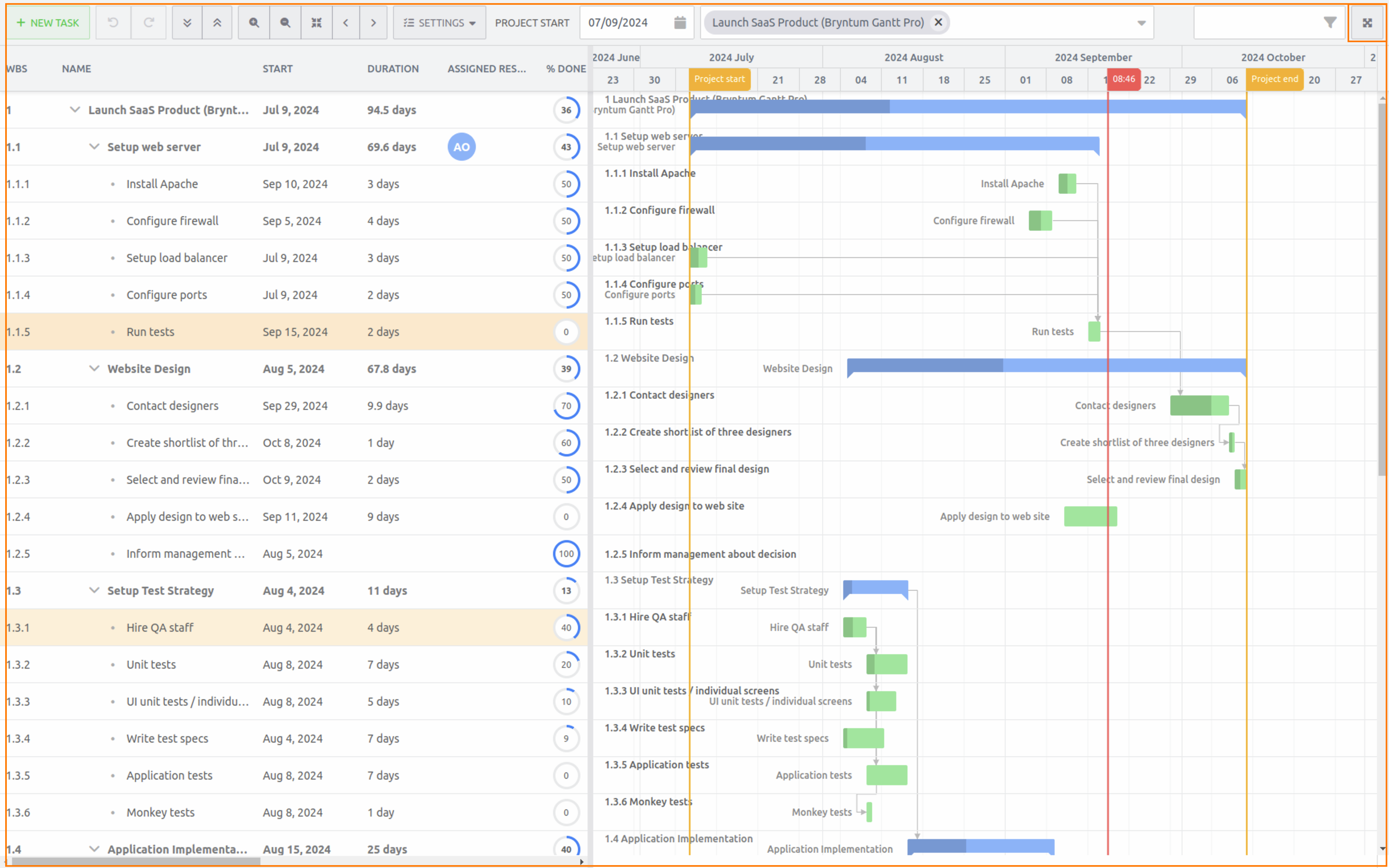
3.3.11 Fullscreen

This button automatically fills the Gantt view to fit your screen.
Going full screen allows you to see just the bar, grid, and timeline of the Gantt and doing away with the sometimes cumbersome Odoo module and browser UI. Having the Gantt across your screen, allows you to have a better overview of your tasks and focus solely on them. Once you're done, press esc to exit.
4. Columns
The grid view exists of columns. These can be rearranged to your liking, by simply dragging and dropping them to the order you prefer.
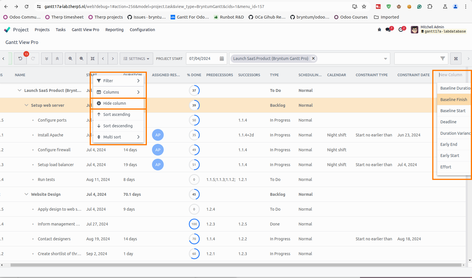
By right-clicking on a column, the following options appear:
- Filter: allows you to filter a column according to the available data in the selected column.
- Columns: allows you to hide, or re-add columns from the grid you've hid.
- Hide column: allows you to hide the column you’ve right-clicked on.
- Sort ascending/descending: allows you to sort the selected column in ascending or descending formation.
- Multi sort: allows you to sort all the visible columns in ascending or descending formation.
Scrolling to the right in the grid shows you all the columns you’ve selected. On the far right, you’ll also see ‘New Column’. This allows you to add ready-created columns to the grid-view.
5. Settings Tab and UI
The settings tab contains many extra features that you can toggle on or off, depending on your preference. Let's go over all of them and explain what they do and how they work.
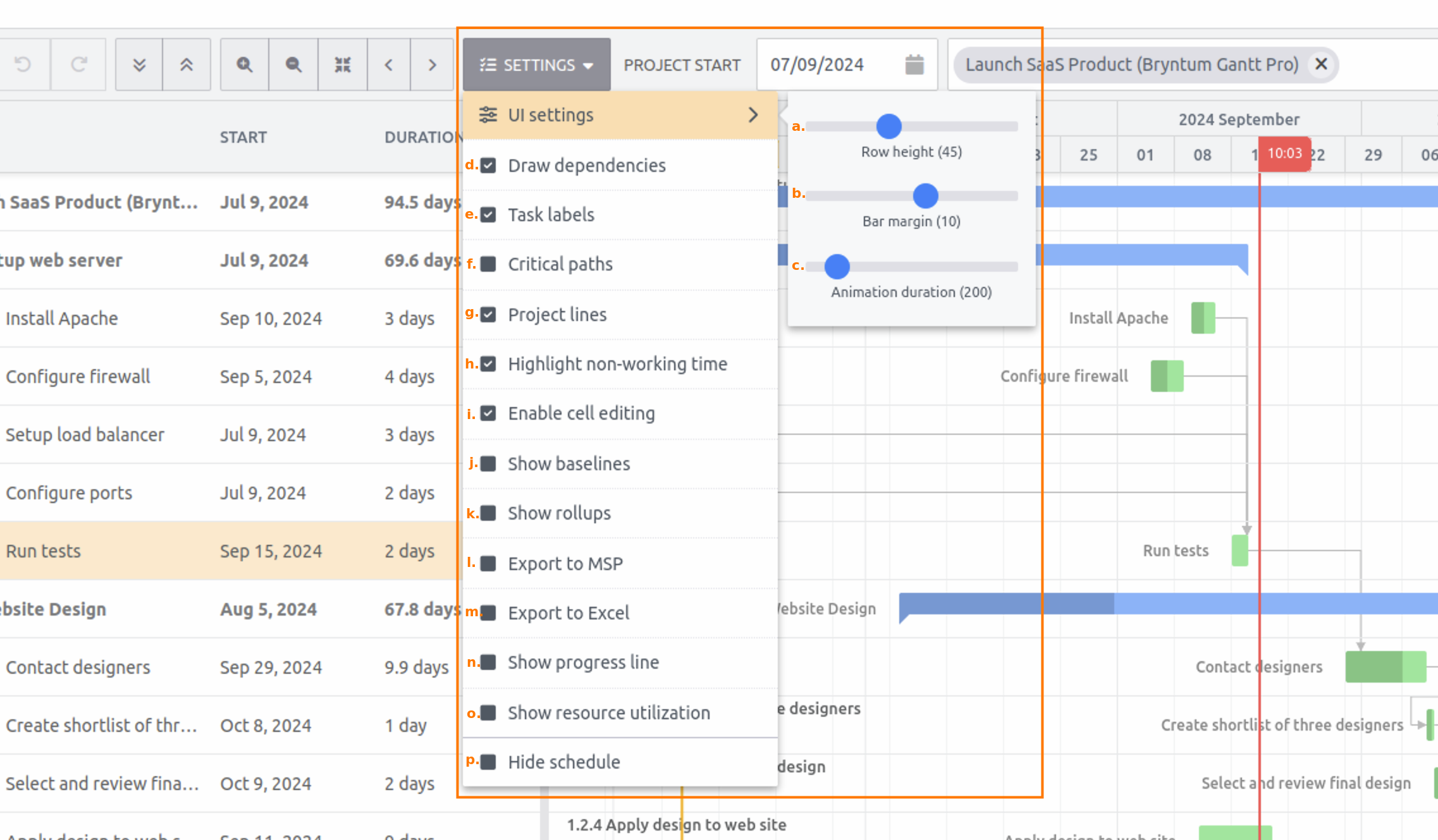
5.1 UI Settings:
5.1.1 Row Height
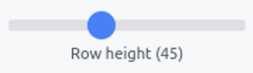
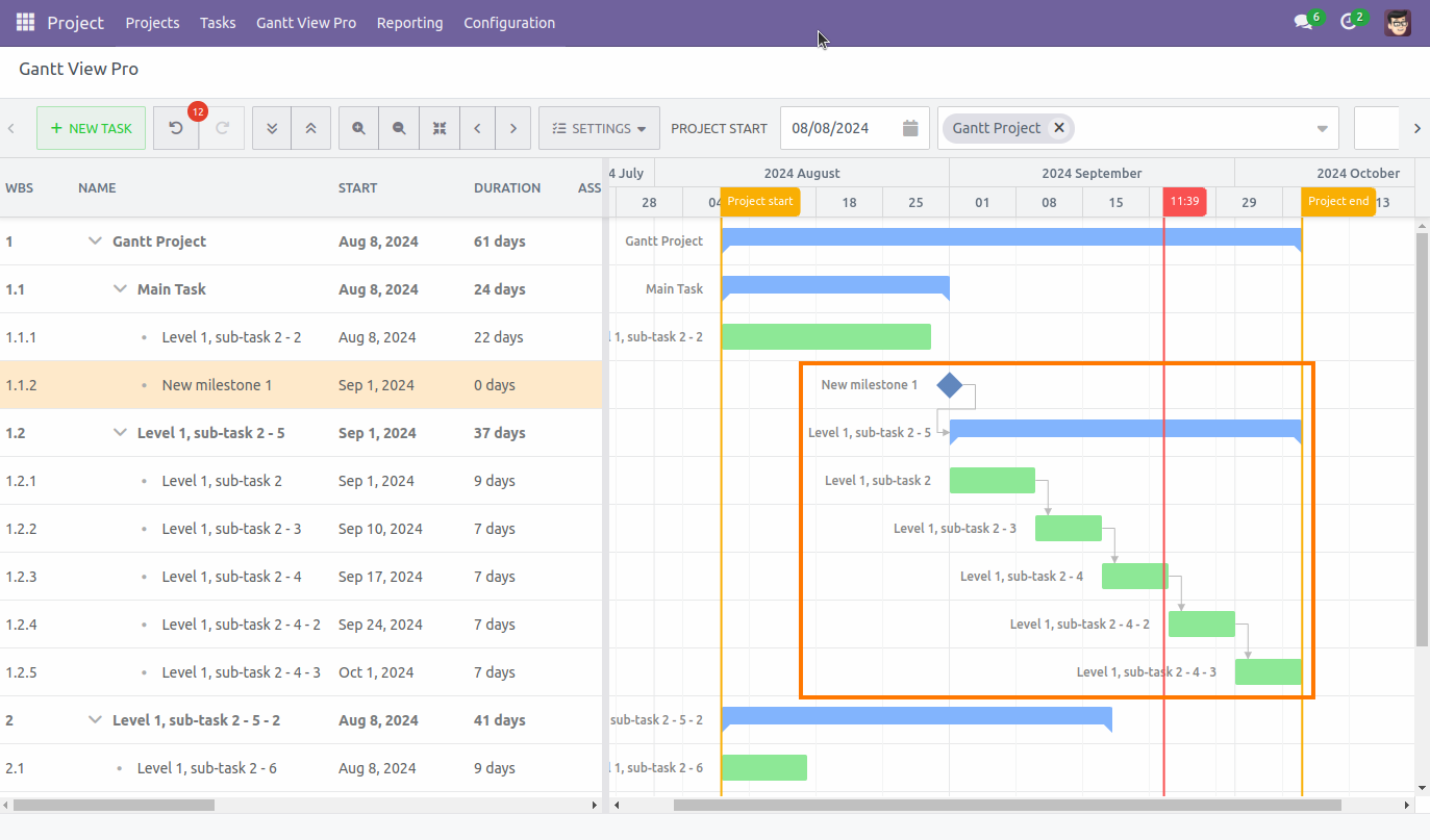
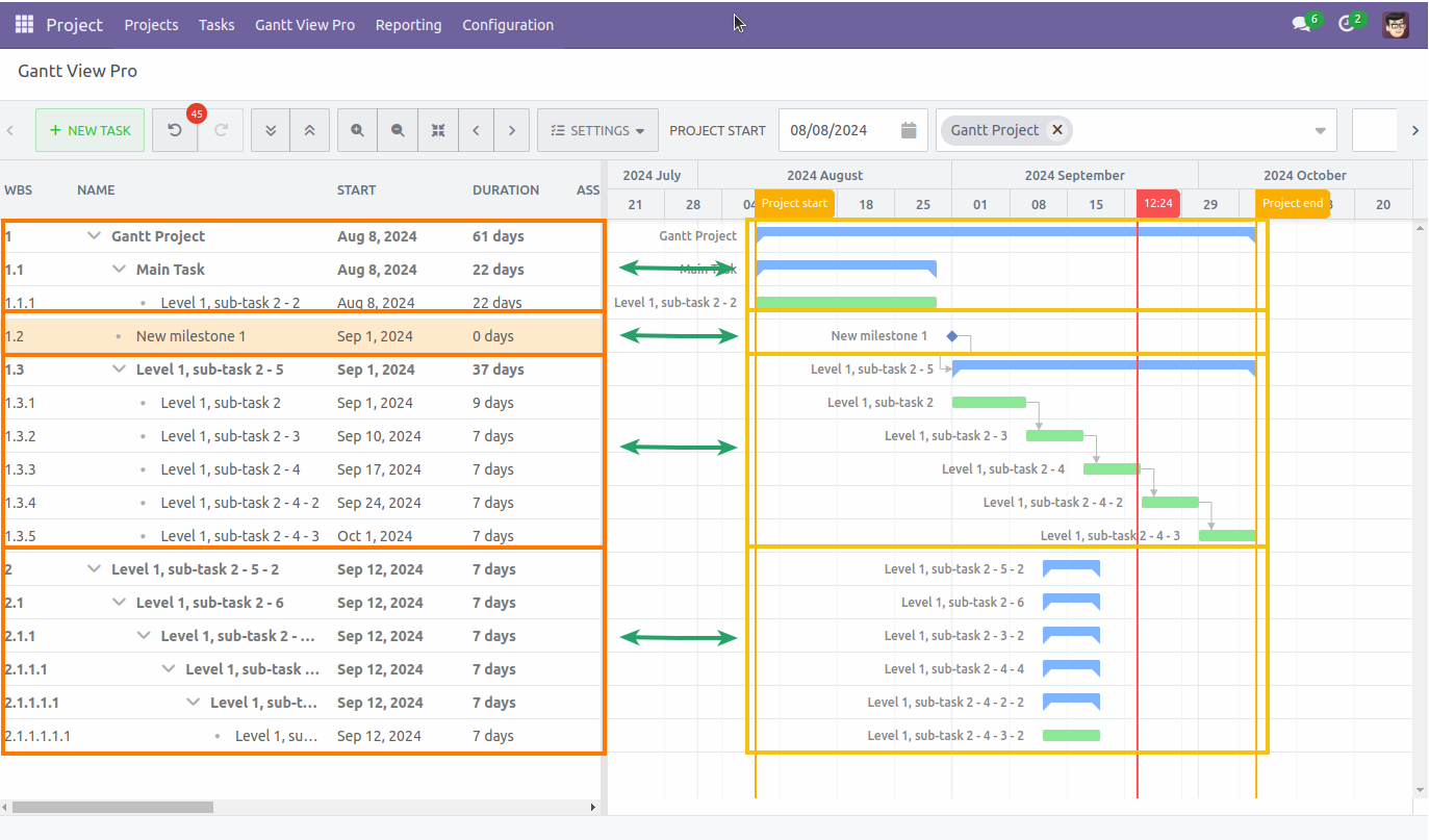
Changes the row height of the cells in the timeline. The more to the left you go, the narrower the rows. Drag it more to the right, the wider each row gets.
5.1.2 Bar Margins
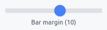
Changes the height of tasks and projects in the timeline. Drag it to the left, and it increases the size of the margins. Drag it to the right, and it decreases them.
5.1.3 Animation Duration
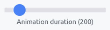
Allows you to select the duration of an animation in milliseconds. Drag it to the right, and it increases the duration. Drag it to the left, and the duration will decrease. Currently, this feature is disabled in the Gantt as no animations are present.
Below two examples: one where both the row height and margins are at their largest, and one where they're at their smallest.
5.2 Features:
5.2.1 Draw dependencies
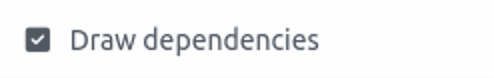
Allows you to drag dependencies between tasks and projects in the timeline. Dependencies are closely related to predecessors and successors. By the way you connect tasks, you help set these up. For more information, head to the Predecessors tab and Successors tab sections.
Drawing a dependency is done as follows: When you go to the end or beginning of a task on the timeline, you'll see a white dot appear. Once you see it, there are 4 simple steps to drag a dependency.
- Grab the white dot.
- Drag it to the task you want it to depend on.
- When the line turns green, let go.
- A dependency line is visible between the two tasks.
To delete a dependency, double click on the task, go to the Predecessors tab, select the task you want to delete the dependency for, and click the trash can icon. Head to section Add/Delete predecessors for more information.
5.2.2 Task labels
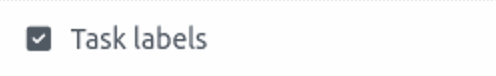
When selected, it shows the task- and project names in the timeline view. When unselected, it hides them.
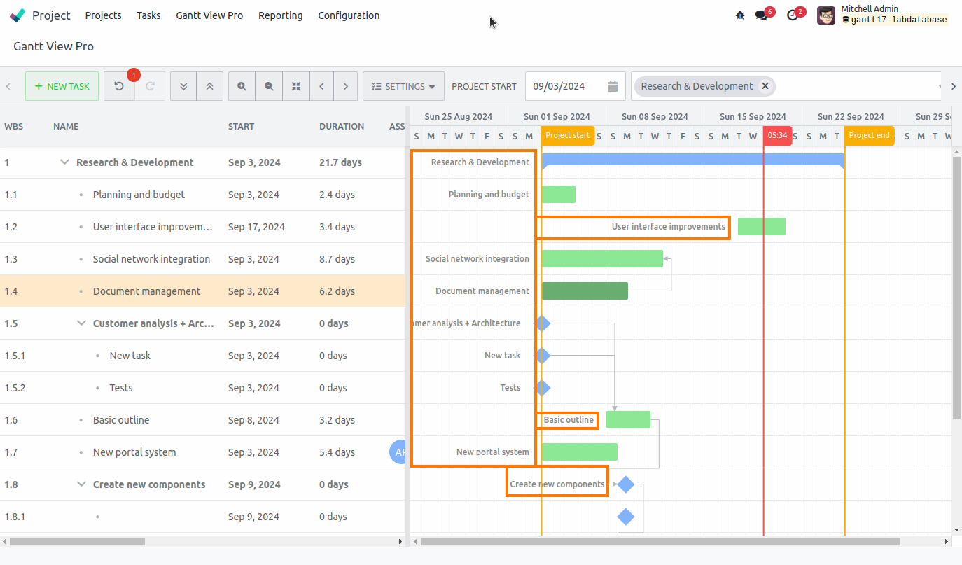
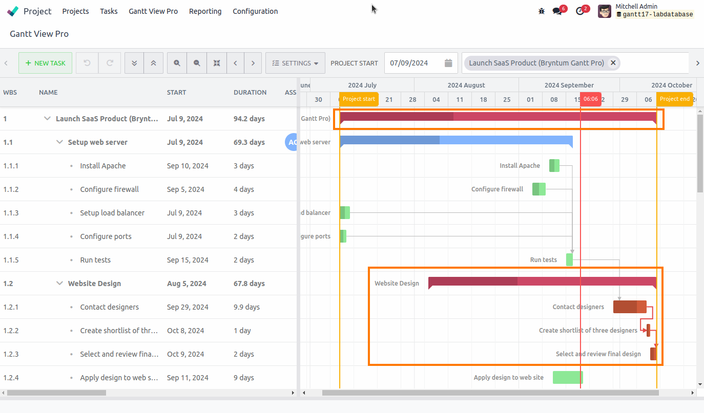
5.2.3 Critical path
Shows a chain of linked tasks that affect the project finish date. If any task on the critical path is late, the whole project will be late.
When checked, the project and the tasks that can cause it to be delayed will show up as red.
E.g. in the example below, if the website design milestone and it's tasks run into overtime, the project will go past its end date and be delayed.
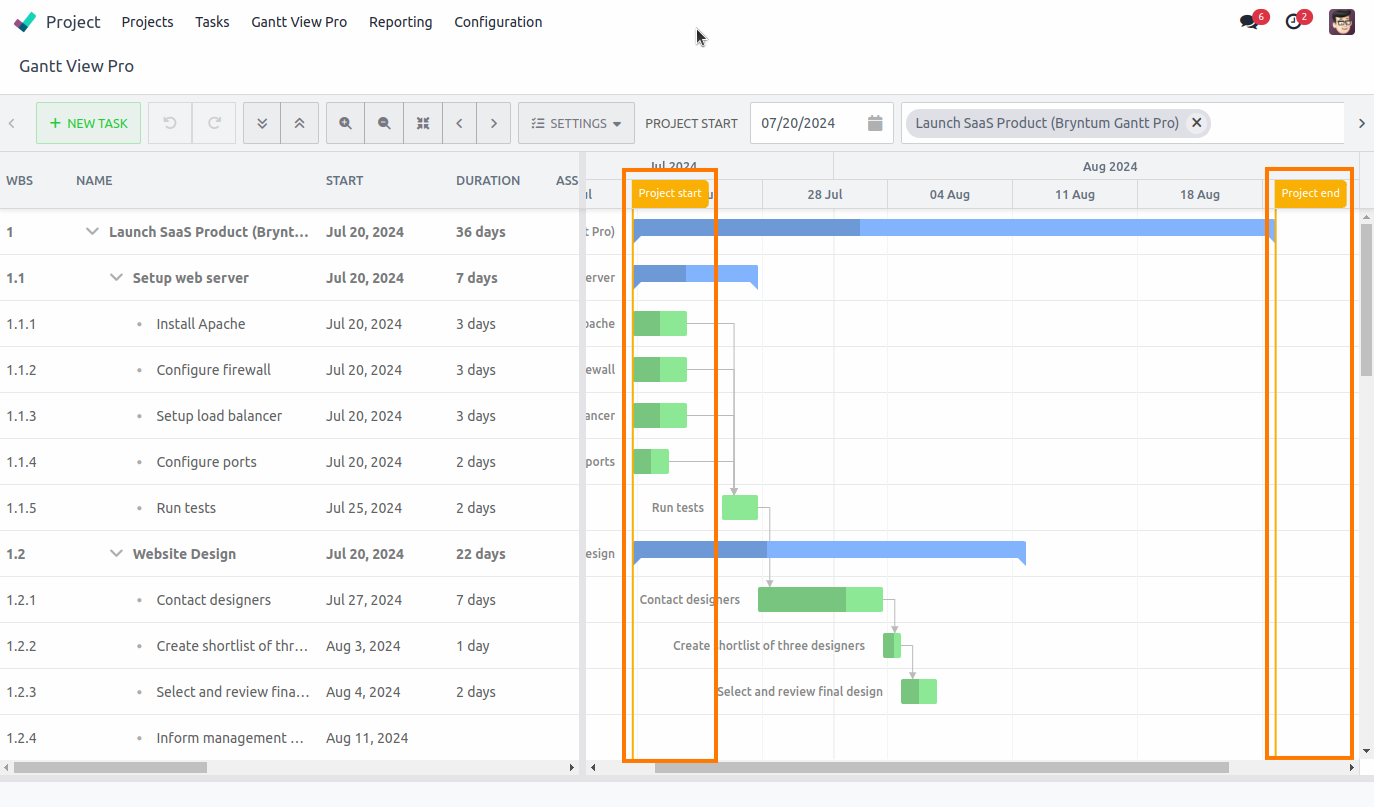
5.2.4 Project lines
Shows the Project start- and end lines in the timeline.
5.2.5 Highlight non-working time
Shows weekends as grayed-out cells. Currently this feature is disabled due to the feature not being present yet.
5.2.6 Enable cell editing
When checked, it allows you to edit cell data of columns in the grid. When unchecked, the cell data of columns can't be edited.
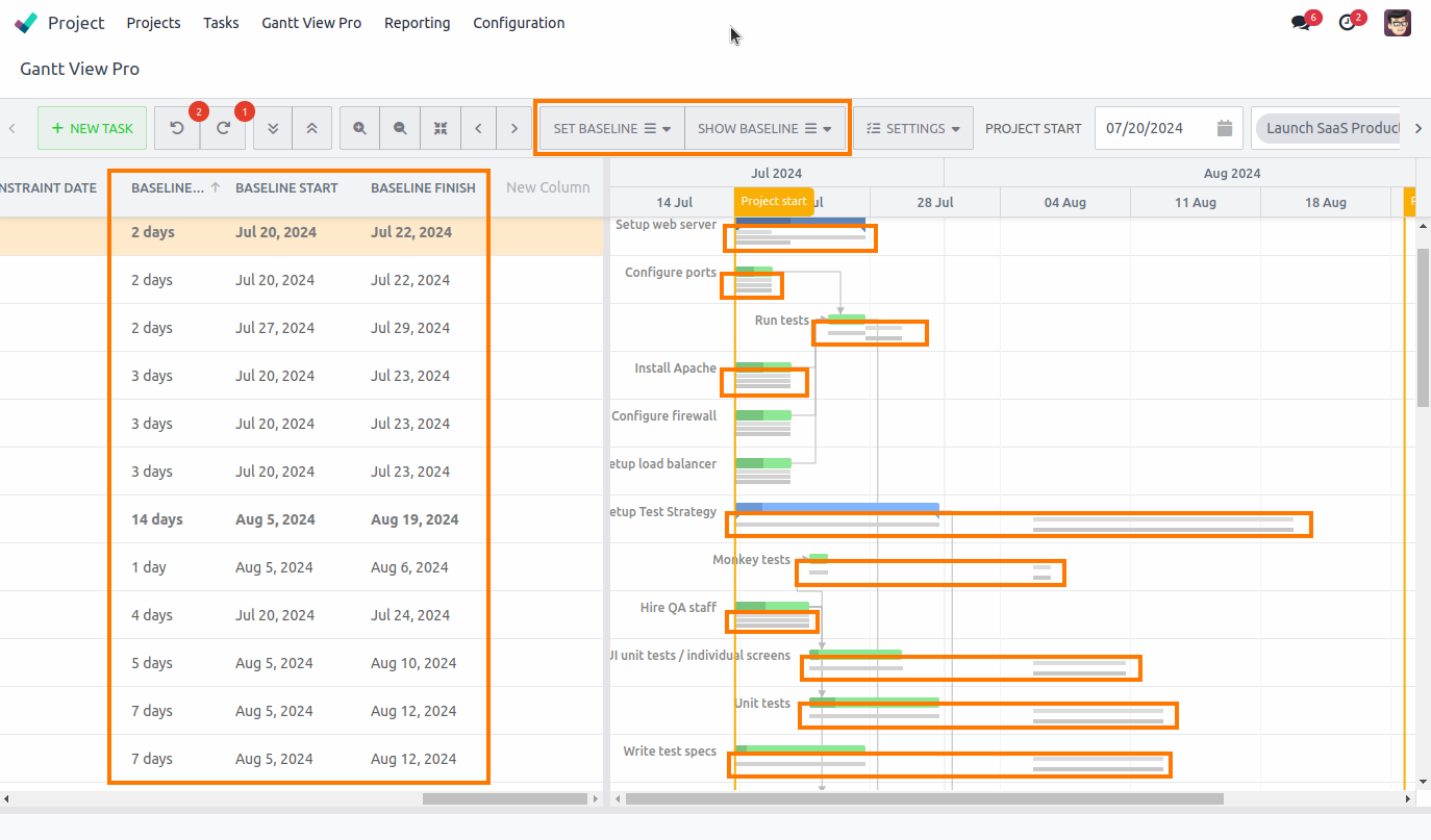
5.2.7 Show baselines
Allows you to set baselines on tasks. *Note: Make sure to add all 3 ‘Baseline’ columns found in ‘New Column’. See the Columns section for more information.
Part of the baseline data can be set, like the 'Baseline duration', 'Baseline start', and 'Baseline finish' columns. If you leave them unchanged, they will take their data from the Start and End date set on task.
The 'Set baselines' tab will also have appeared in the bar. This allows you to recalculate a baseline, for instance, after you've made changes to a task.
Next to it is the 'Show baselines' tab, which allows you to toggle the three baselines, if needed.
5.2.8 Show rollups

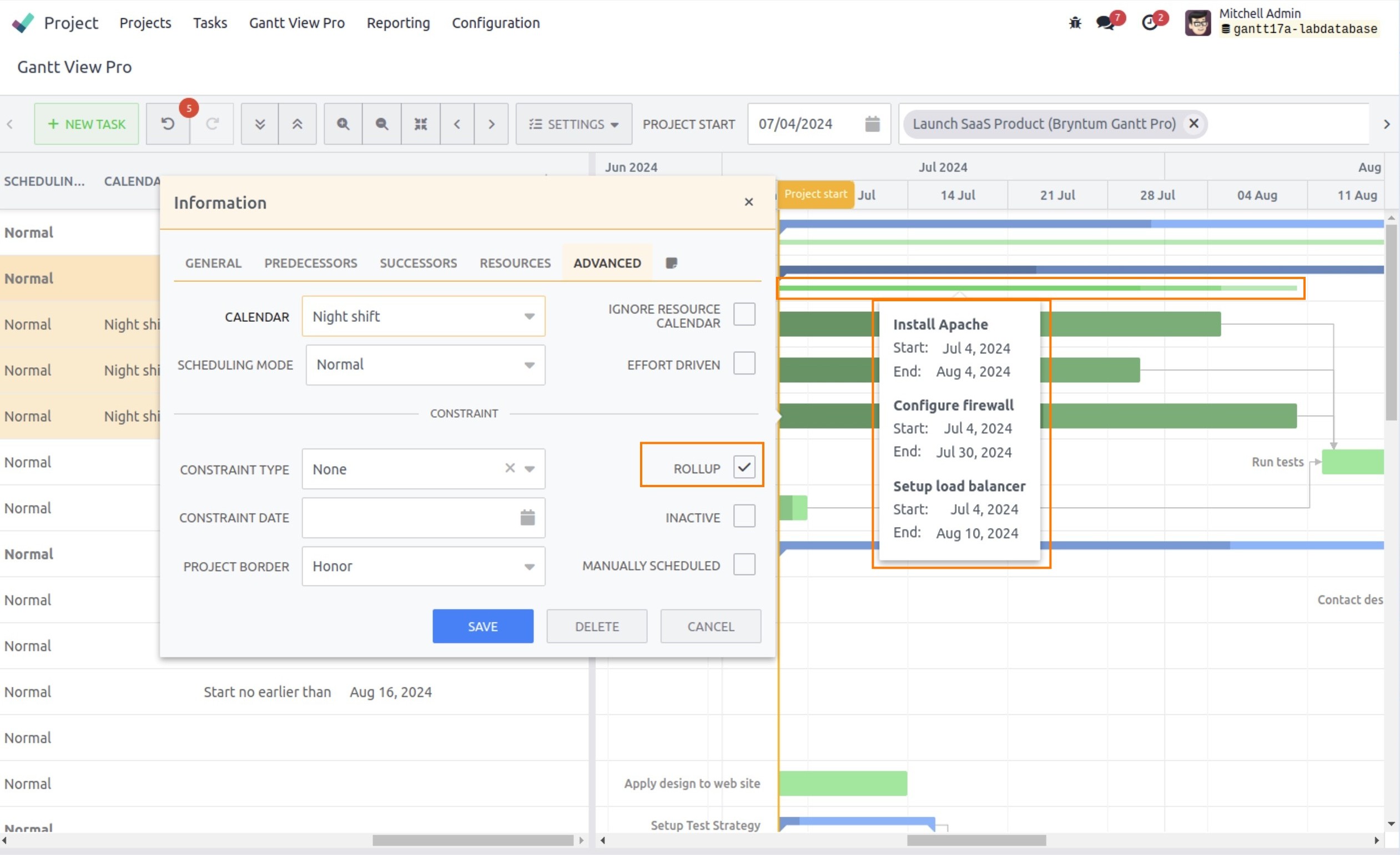
Allows you to display a small bar below its summary task in the timeline. These become visible for each task where you select the 'Rollup' checkmark in the Advanced tab (see the Advanced tab section for more information), when double-clicking on the task. Each of the rollup elements show a tooltip when hovering over it with details of the tasks within the rollup.
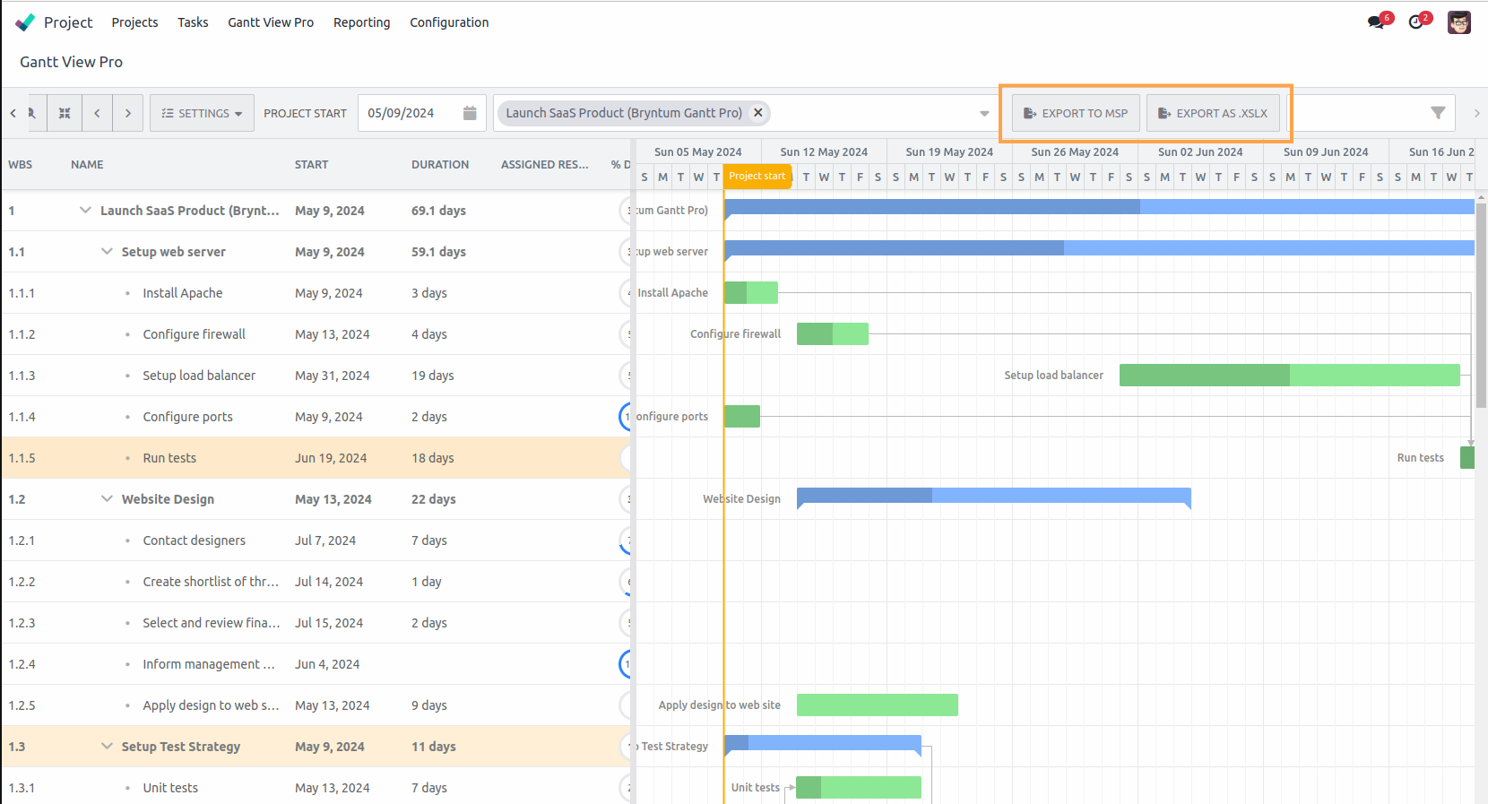
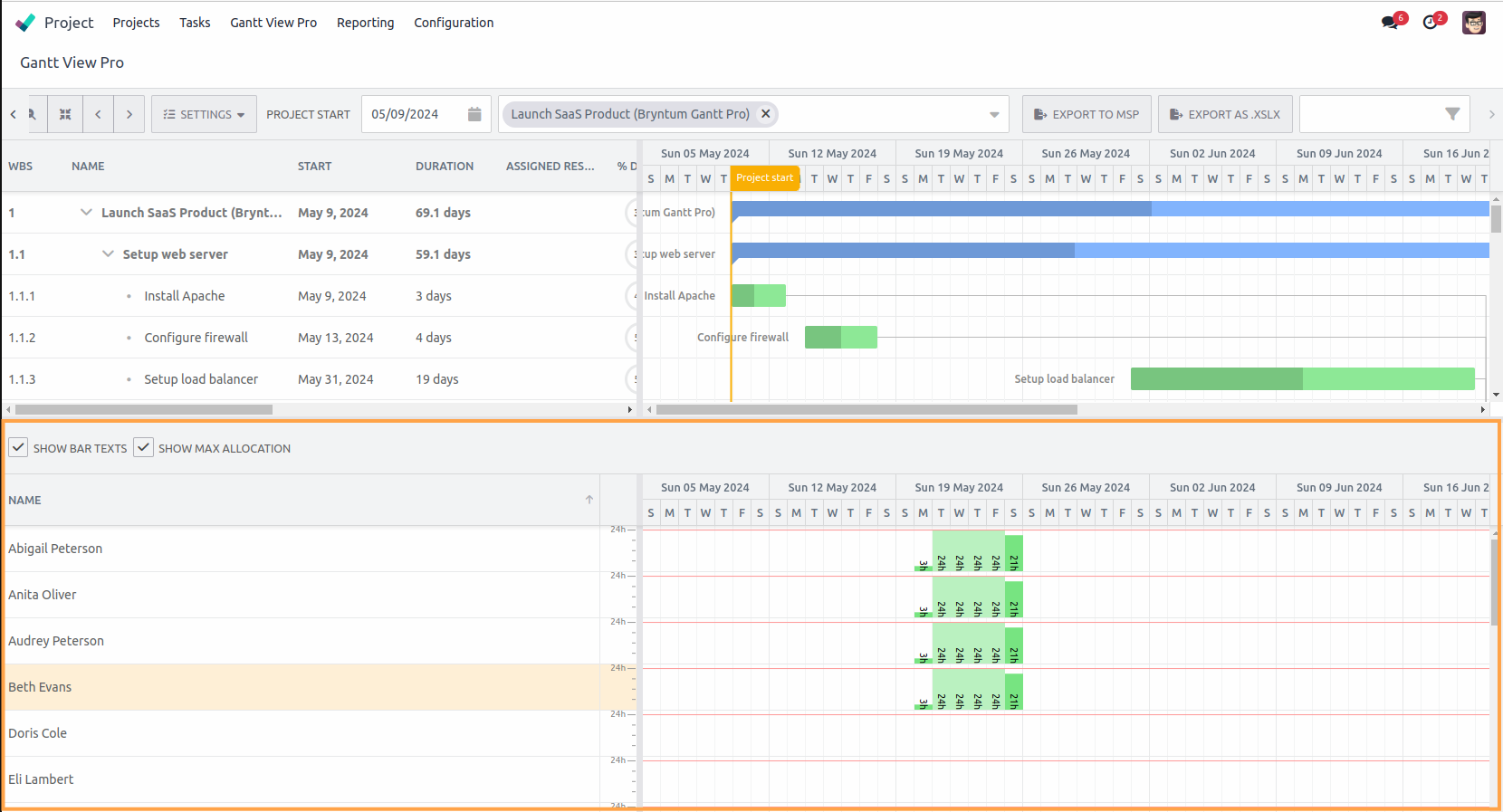
5.2.9 Export to MSP

Allows you to export the open project(s) in the Gantt View to Microsoft Project. The Export feature will be added to the bar; see image displayed underneath point 'm', below. Pressing it will initiate the download.
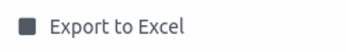
5.2.10 Export to Excel
Allows you to export the open project(s) in the Gantt View to Excel. The Export feature will be added to the bar. Pressing it will initiate the download.
5.2.11 Show progress line
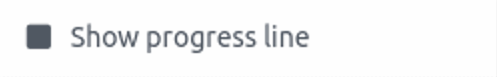
Shows a set of SVG elements drawn between all the tasks in relation to the current date. It's a visual aid that shows where each task is in relation to the others at a certain point on time.
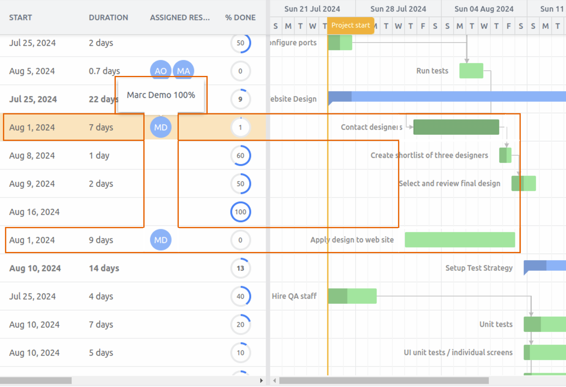
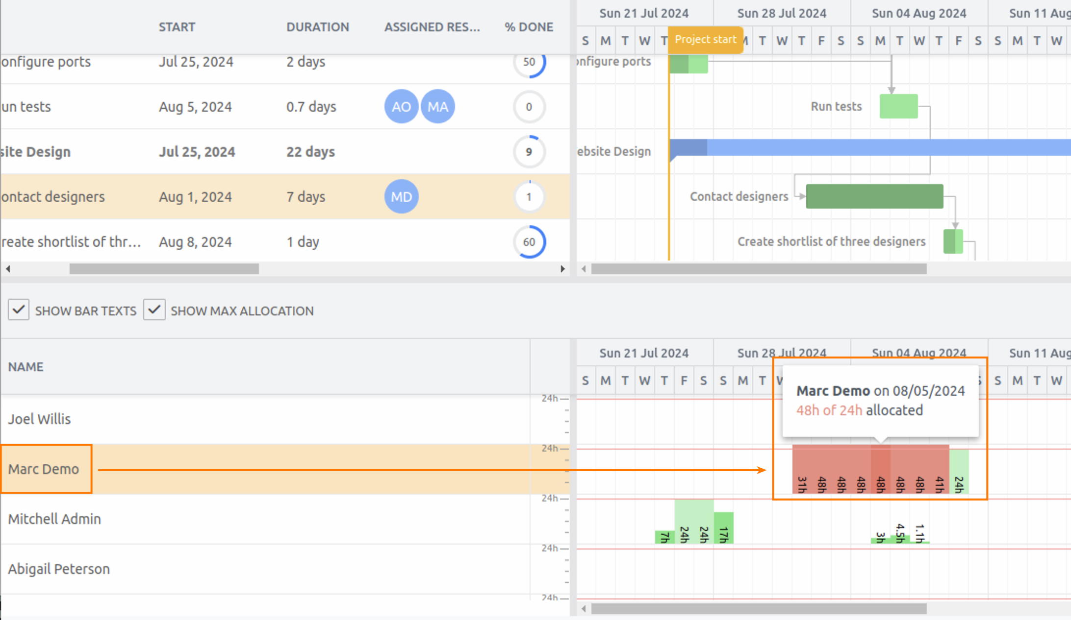
5.2.12 Show resource utilization
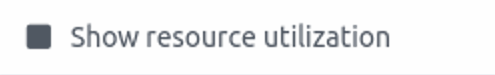
Shows how the resources available time has been distributed between the tasks assigned to them. Selecting it, opens an additional section, showing the resources and how much time has been allocated to each.
You also have two options on the left side of the resource utilization section:
- Show bar texts, which adds a time stamp to the right side of the utilization view.
- Show max allocation, which shows a red line on the right side of the utilization view, indicating the max time available of each resource, based on their selected calendar.
With this information, you can quickly determine whether a resource is over their capacity, are on schedule, or have time left for more tasks.
5.2.13 Hide schedule

Hides the schedule, showing only the grid view with its columns. This can also be achieved by clicking on the arrows in the center of the line that divides the grid and timeline. Pressing them, allows you to show only the grid, or only the timeline, or both.
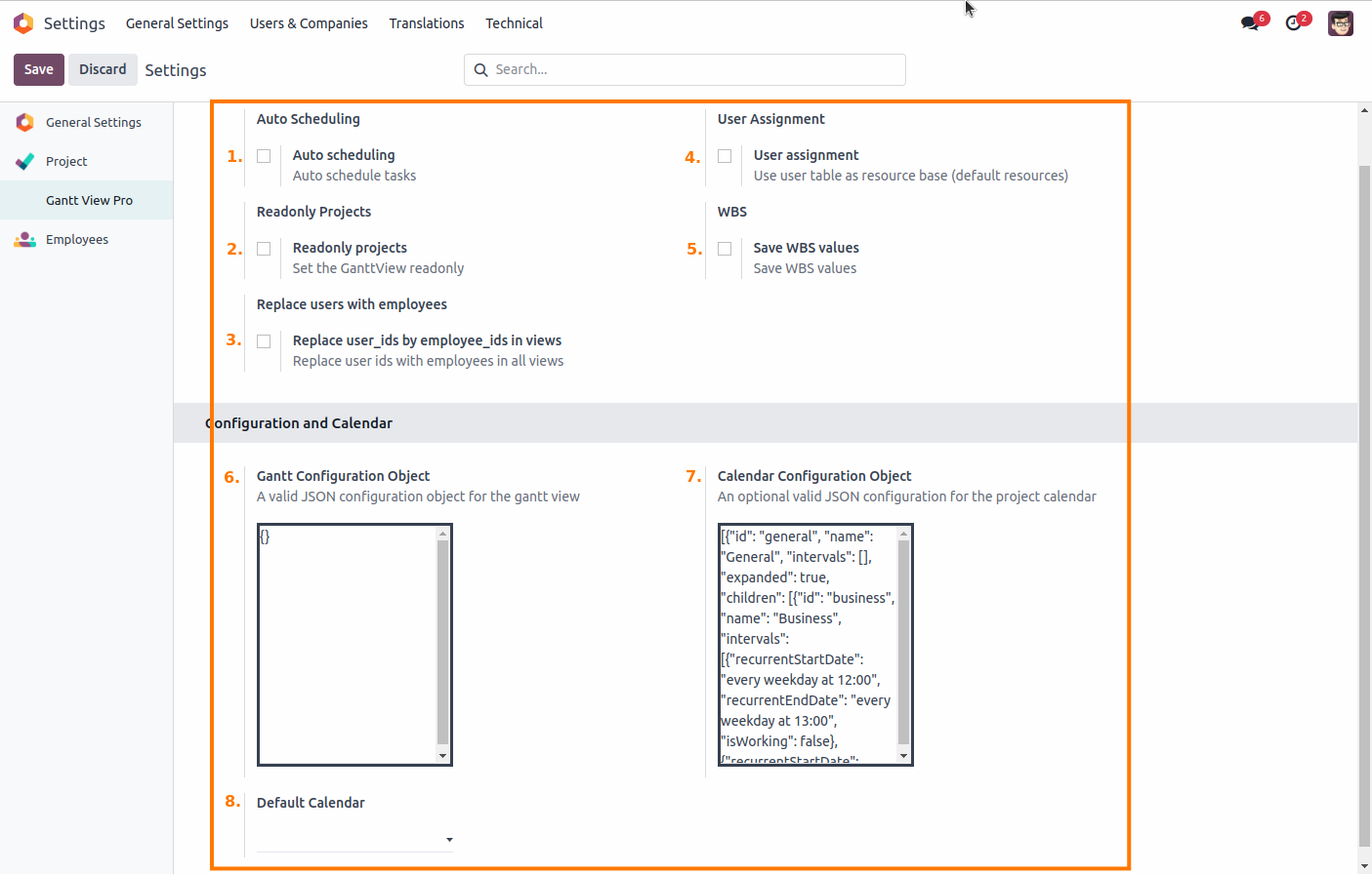
6. Gantt View Pro Settings menu
This is where you can change settings that happen on the backend. Follow Configurations - Settings - Gantt View Pro to see them. There are a number of things you can do here. Let's go over them, explain what they do, and how they work.
6.1 Auto scheduling
Selecting this feature will globally auto-schedule tasks in projects.
6.2 Readonly projects
Selecting this feature will set the Gantt View as readonly for all users; no data can be selected or changed, and no tasks or projects can be moved around in the Gantt View while this is checked.
6.3 Do not compute WBS
Selecting this feature allows you to upload project files using their assigned WBS values instead of the Gantt recalculating them and showing these upon uploading.
6.4 Save WBS values
Selecting this feature will replace WBS values set in an uploaded file by the Gantt's own. It will also save the existing WBS values on tasks in projects when you export them.
6.5 User assignment
Selecting this feature will use the user table as the default base for assigning resources. This means that all users that have been added to Settings - General settings - Manage users are visible and selectable as resources in the Gantt view, on top of the employees (head to the Resources tab section for more information).
6.6 Gantt Configuration Object
This field allows you to introduce simple features to the Gantt view by adding custom JSON. Here are a couple of examples:
This code snippet adds scroll buttons to the Gantt View, allowing you to scroll to the task currently not in the center of the screen. The name of the task is also displayed with the scroll button.
{
    features : {
        scrollButtons : {
            labelRenderer({ taskRecord }) {
                return `${taskRecord.wbsCode} ${taskRecord.name}`;
            }
        }
    }
}
This code snippet replaces the square lines of the dependencies with rounded lines.
{
    features : {
        regionResize   : false,
        nonWorkingTime : false,
        pan            : true,
        dependencies   : {
            // Makes dependency lines easier to click
            clickWidth : 5,
            radius     : 15
        }
    }
}
This code snippet is a bit more complex. It changes the layout of the Gantt View, adds rounded dependency lines, places the name of tasks to the left, it changes the width of milestone tasks, and it also hides the Project bar.
{
columnLines : false,
features    : {
    projectLines : false,
    rollups      : true,
    dependencies : {
        radius     : 10,
        clickWidth : 5,
        renderer({ domConfig, dependencyRecord }) {             domConfig.class.crossProject = dependencyRecord.isCrossProject;
        },
        tooltipTemplate(dependencyRecord) {
            return [
                { tag : 'label', text : 'From' },
                { text : dependencyRecord.fromEvent.name },
                { tag : 'label', text : 'To' },
                { text : dependencyRecord.toEvent.name },
                { tag : 'label', text : 'Lag' },
                { text : `${dependencyRecord.lag || 0} ${DateHelper.getLocalizedNameOfUnit(dependencyRecord.lagUnit, dependencyRecord.lag !== 1)}` },
                dependencyRecord.isCrossProject ? { tag : 'label', text : 'Cross project dependency' } : undefined
            ];
        }
    },
    labels : {
        right : {
            field : 'name',
            renderer({ taskRecord, domConfig }) {
                domConfig.children = [taskRecord.name];

                if (taskRecord.prio) {
                    domConfig.children.push({
                        class   : 'b-prio-tag',
                        dataset : {
                            btip : 'Priority ' + taskRecord.prio
                        },
                        text : taskRecord.prio
                    });
                }
            },
            editor : {
                type : 'textfield'
            }
        }
    }
}
This code snippet will change the hours of the Gantt from 24 to 8. Works only in combination with the example given in the Calendar Configuration Object, below.
{
    "workingTime": {
        "fromDay":1,"toDay":6,"fromHour":8,"toHour":16
    }
}
6.7 Calendar Configuration Object
With this feature you can create a valid JSON configuration for the project calendar. This is separate and different from the calendars you can select under Default Calendar. An example below:
This code snippet, in combination with the last code snippet for the Gantt Configuration Object, will change the Gantt View to behave like a Business work week, with hours from 9am to 5pm, Monday to Friday.
{
    "id": "general",
    "name": "General",
    "intervals":
        [], "expanded": false,
            "children":
            [{"id": "business", "name": "Business",  "unspecifiedTimeIsWorking" : false,
            "intervals":
            [{"every weekday at 08:00", "every weekday at 16:00", "isWorking": true
        }]
    }]
}
This next JSON snippet works on it's own. It a setup for a person that only works on Monday's.
{
    "id": "user_defined",
    "name": "General",
    "intervals": [
        {
            "recurrentStartDate": "at 09:00 on Monday",
            "recurrentEndDate": "at 17:00 on Monday",
            "isWorking": True
        },
        {
            "recurrentStartDate": "at 09:00 on Tuesday",
            "recurrentEndDate": "at 17:00 on Tuesday",
            "isWorking": True
        },
        {
            "recurrentStartDate": "at 09:00 on Wednesday",
            "recurrentEndDate": "at 17:00 on Wednesday",
            "isWorking": True
        },
        {
            "recurrentStartDate": "at 09:00 on Thursday",
            "recurrentEndDate": "at 17:00 on Thursday",
            "isWorking": True
        },
        {
            "recurrentStartDate": "at 09:00 on Friday",
            "recurrentEndDate": "at 17:00 on Friday",
            "isWorking": True
        },
        {
            "recurrentStartDate": "at 00:00 on Saturday",
            "recurrentEndDate": "at 23:59 on Saturday",
            "isWorking": False
        },
        {
            "recurrentStartDate": "at 00:00 on Sunday",
            "recurrentEndDate": "at 23:59 on Sunday",
            "isWorking": False
        }
    ],
    "hoursPerDay": 8,
    "expanded": True,
    "children": [
        {
            "id": "business",
            "name": "Business",
            "intervals": [
                {
                    "recurrentStartDate": "at 12:00 on Monday",
                    "recurrentEndDate": "at 13:00 on Monday",
                    "isWorking": False
                },
                {
                    "recurrentStartDate": "at 17:00 on Monday",
                    "recurrentEndDate": "at 08:00 on Tuesday",
                    "isWorking": False
                }
            ]
        }
    ]
}
For more information on calendar creation, check out this link.
6.8 Default calendar
The calendars you see here are the ones created in Employees – Configuration – Working Schedules. They’ll set the Gantt View to the chosen calendar and reconfigure all existing tasks to fit that schedule.
7. Right-click options
We're going to go over the options when right-clicking on a task in both the grid and the timeline of the Gantt View. Let's start witht the grid side and then move over to the timeline.
The first option you'll see is the 'Edit' option. We'll skip this for now, and go over it in section Options when double-clicking on task in timeline.
The bottom two options, 'Add dependencies' and 'Remove dependencies', are covered in the Draw dependencies, and Add/Delete predecessors sections.
Let's go over the remaining options.
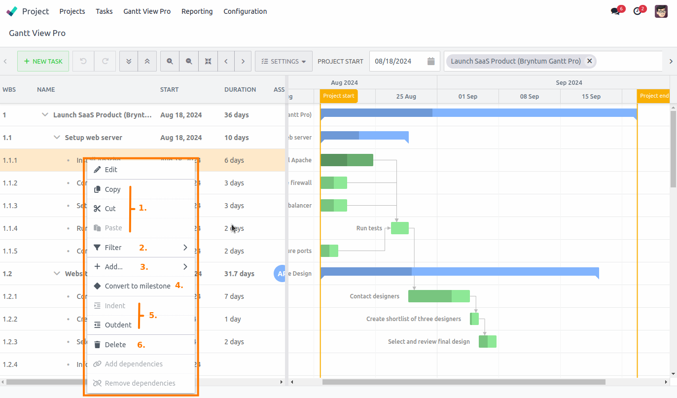
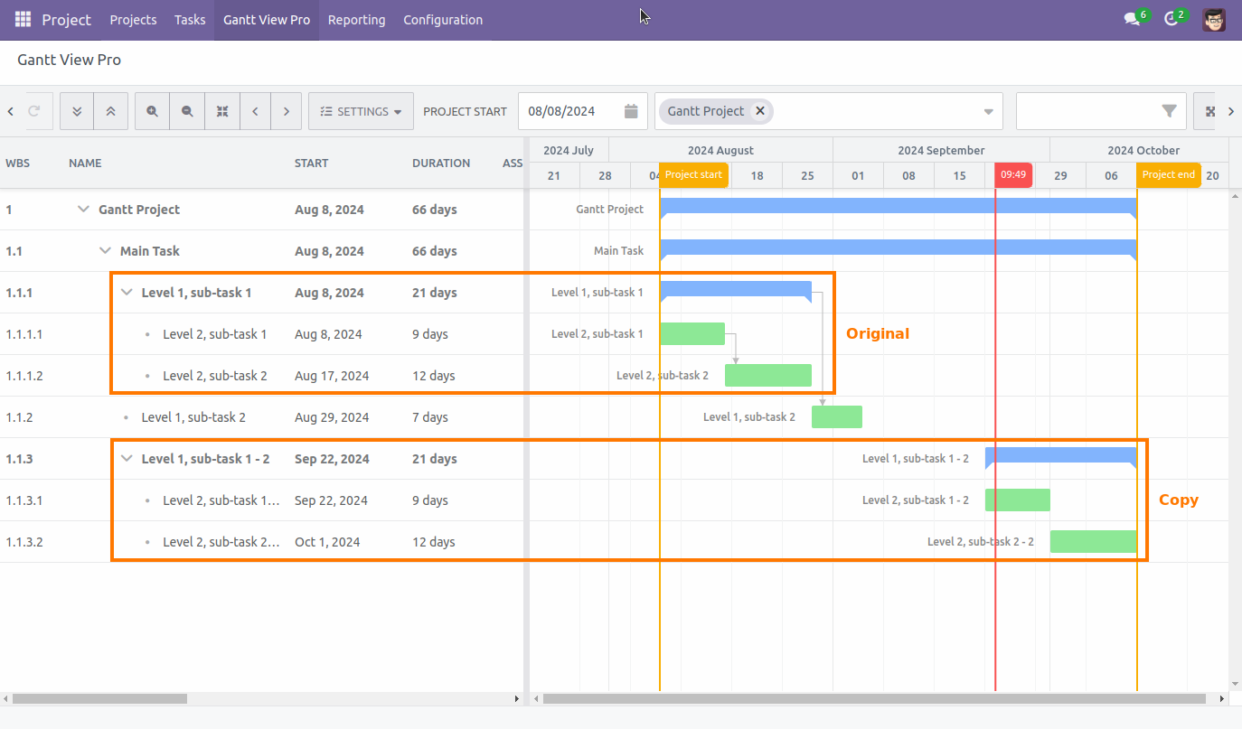
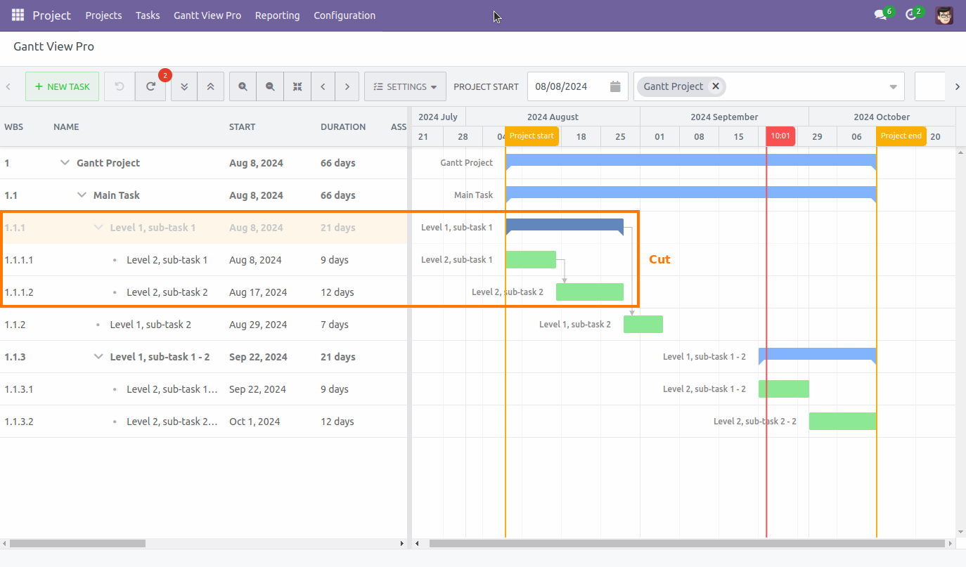
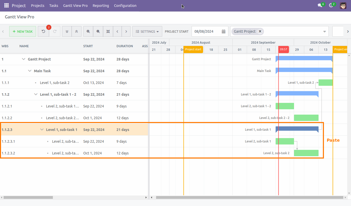
7.1 Copy/Cut/Paste
This allows you to copy, or cut, a task, or milestone, with it's subtasks, and paste it in the Gantt View again.
When you paste, it will happen underneath the task you've selected at the time of pasting. This allows you to determine where you want the paste to happen. The timeline duration of the project is adjusted, when applicable. You can see this in the third screenshot below. The first and second show copy.paste and cut/paste, respectively.
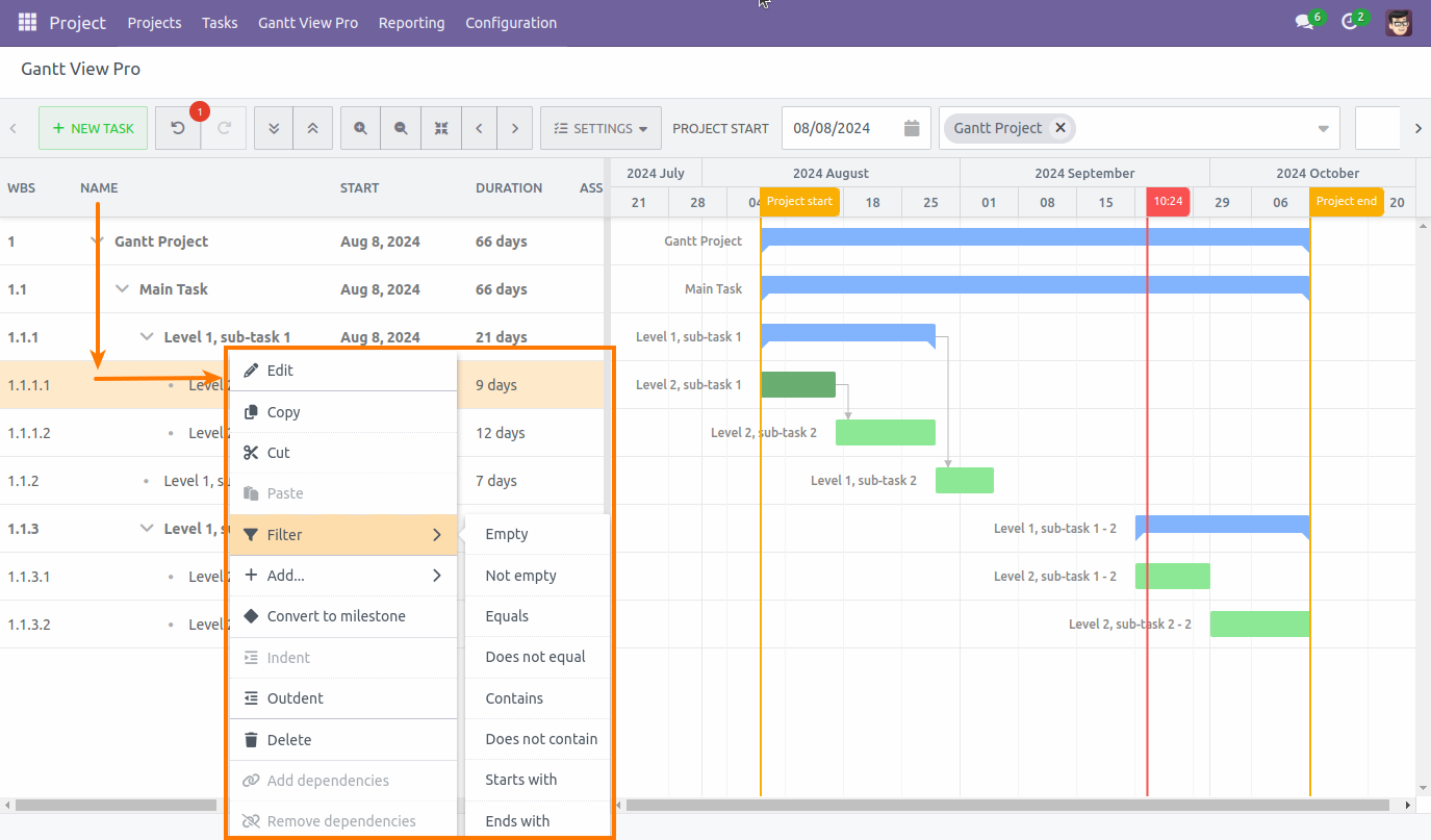
7.2 Filter
You can apply several filters to a task. You'll see all the options available for that task when hovering over the 'Filter' option.
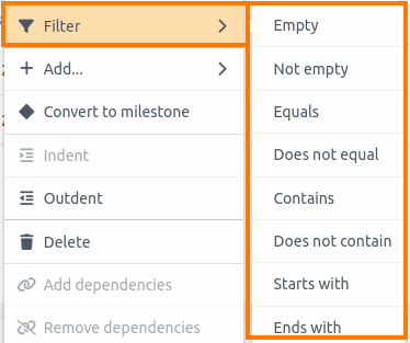
The filter will be applied for the column you are in when right-clicking (e.g. when you've right-clicked a task in the 'Duration' column, the filter will apply to the information that is within that column and filter accordingly. The same is true when you right-click a task when in the 'Name' column, etc).
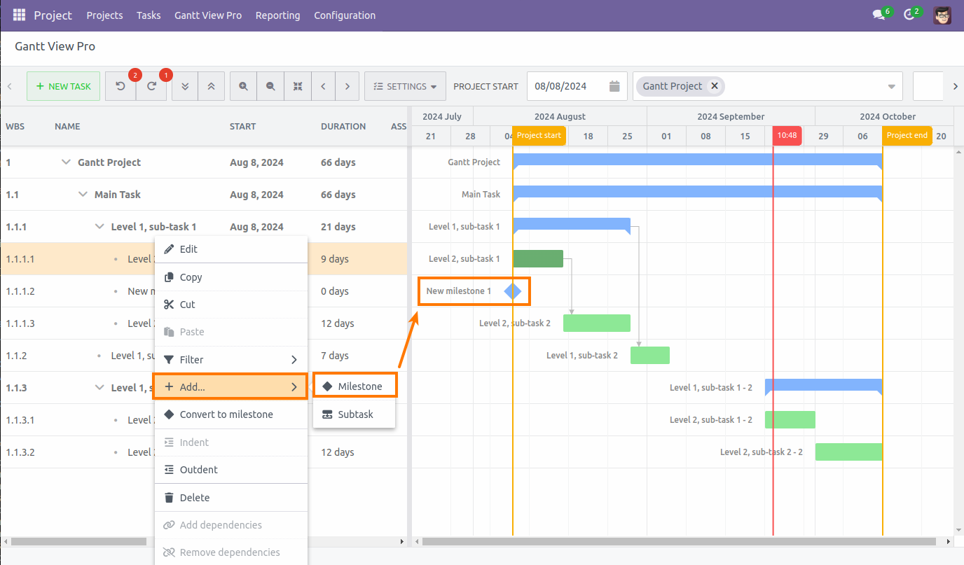
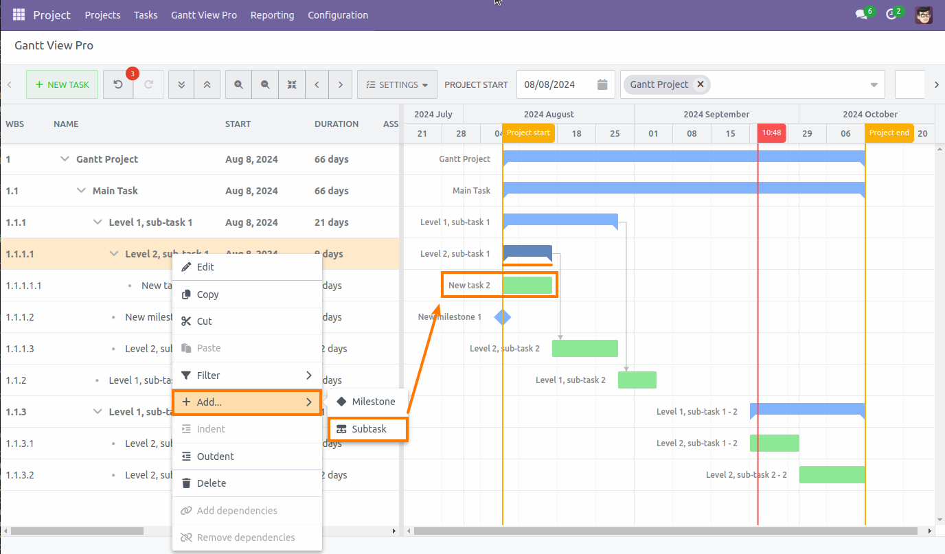
7.3 Add
The 'Add' button allows you to add either a Milestone or a Subtask underneath the task you've right-clicked on.
Milestone: A milestone will appear as a blue diamond shape underneath the task.
Subtask: A subtask will appear underneath the task and give the task above the same type of graphic as a project to indicate that task contains subtasks.
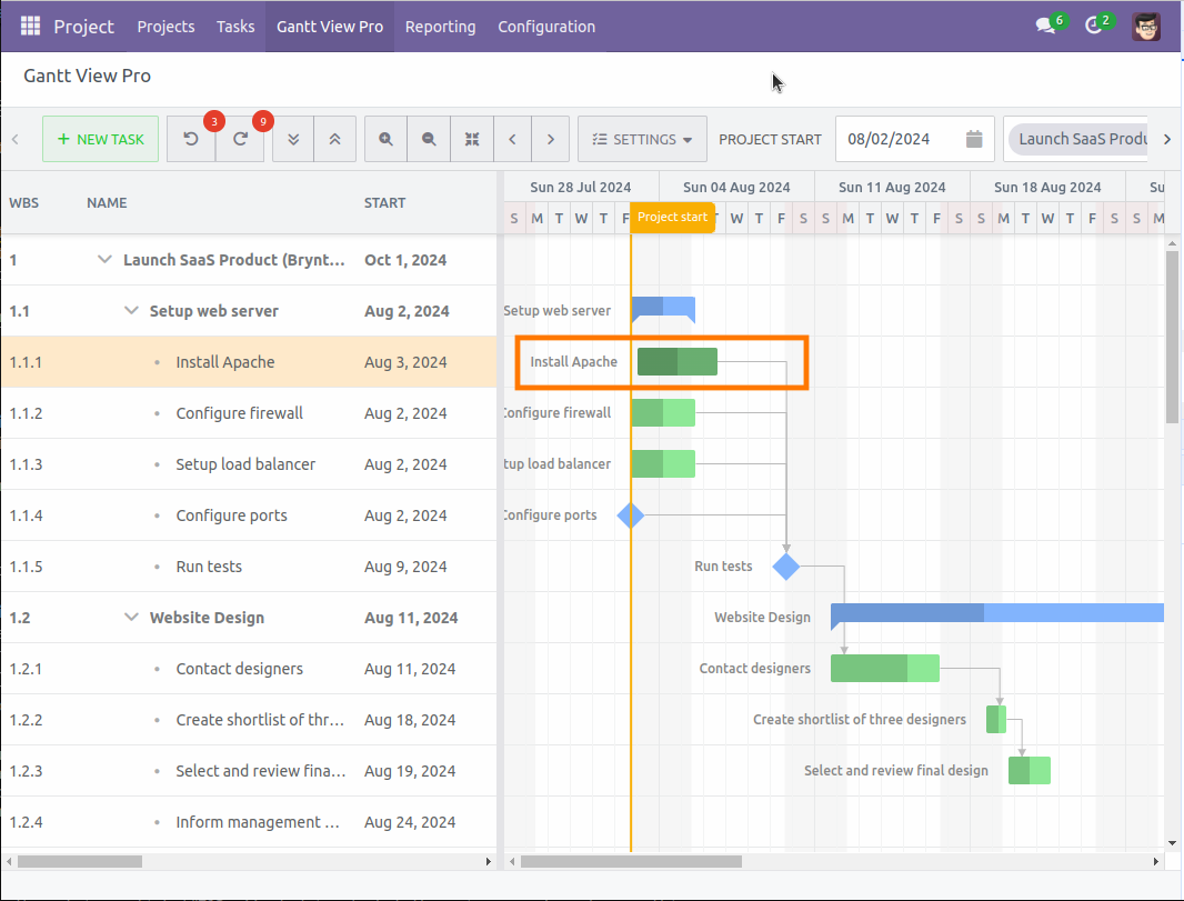
7.4 Convert to milestone
Converting a task to a milestone can be done by right-clicking on the task and selecting 'Convert to milestone'. As described in the previous point, it will appear as a blue diamond shape.
Once converted, you can drag it across the timeline to indicate when the new milestone should start.
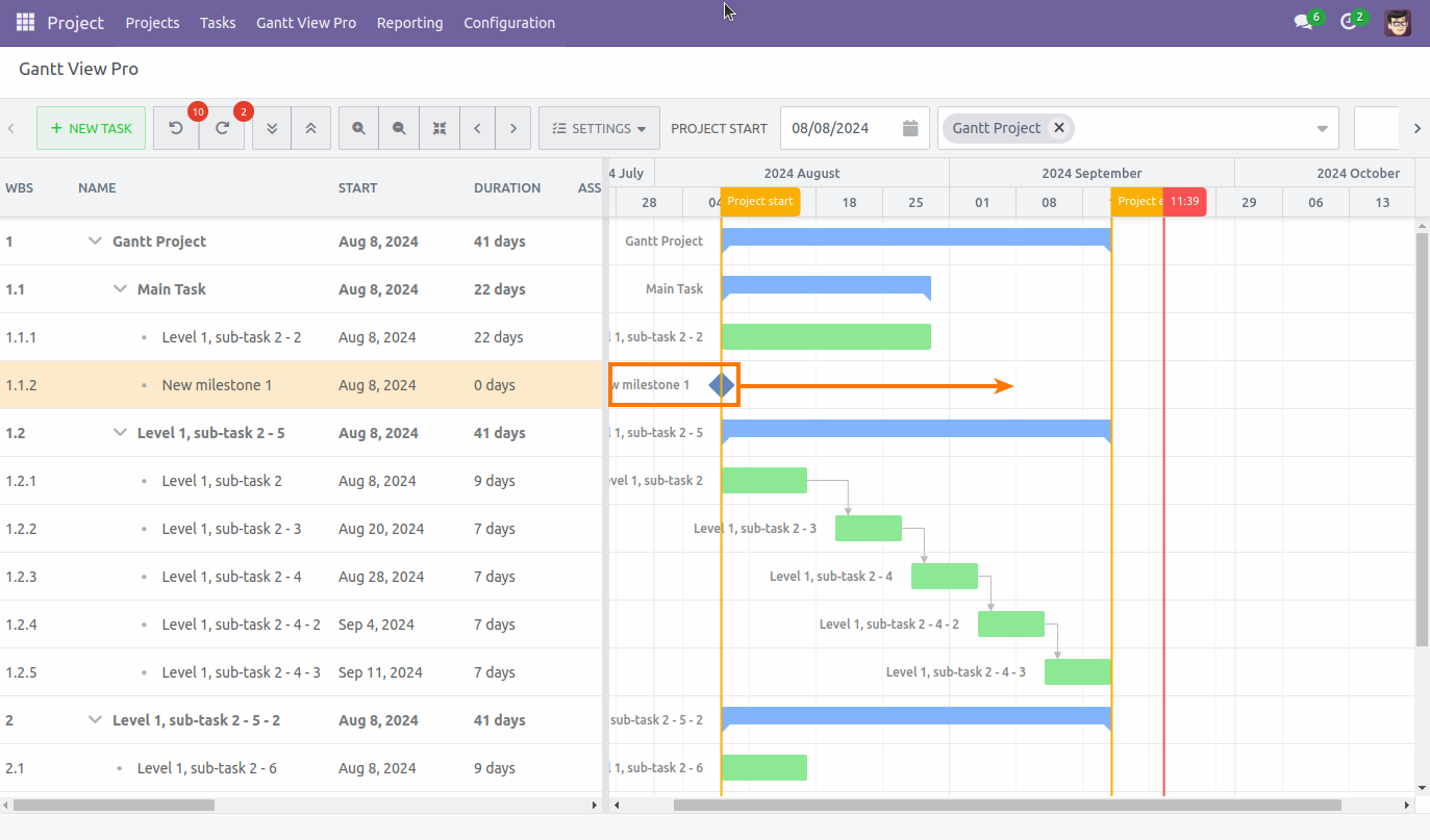
After that, you can drag a dependency (see the Draw dependencies section for more information) to indicate which task is part of the milestone. If that task has corresponding subtasks and dependent tasks, they will become part of that milestone, too.
Tasks and subtasks that are not part of the task will remain unchanged, as you can see above and below the orange square in the screenshot above.
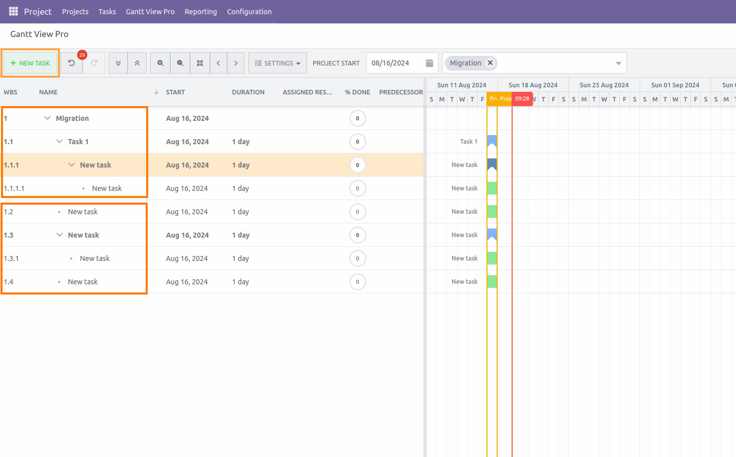
7.5 Indent/Outdent
Indenting or outdenting a task changes the WBS value, indicating whether it is a task, sub task, part of a series, or a new part of the project. The way it's depicted in both the grid and the timeline changes accordingly, too.
7.6 Delete
Selecting 'Delete', deletes the task, subtask, or milestone you've right-clicked on.
Right-click task in timeline
The list when right-clicking on a task in the timeline is very similar to what you get on the grid side, but there are two extra options here: split task and rename. Let's go over them.
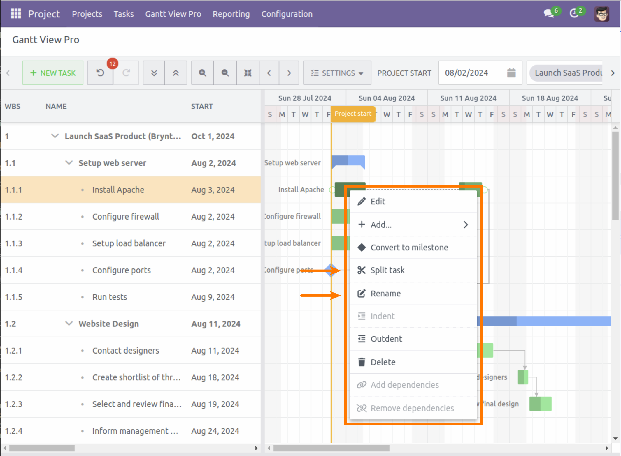
7.7 Split task
Selecting this option will split a task in two parts, connected by a dashed-line.
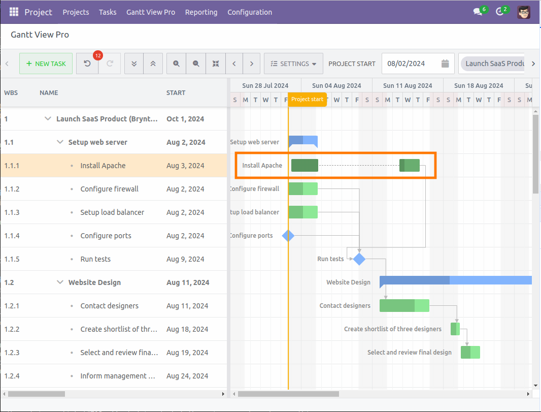
You can give each part a separate length and adjust to how long each section will take. As you move the parts around, the start and end date will adjust according to each part, showing when they need to be initiated.
Depending on your needs, you can split a task again so it consists of three sections.
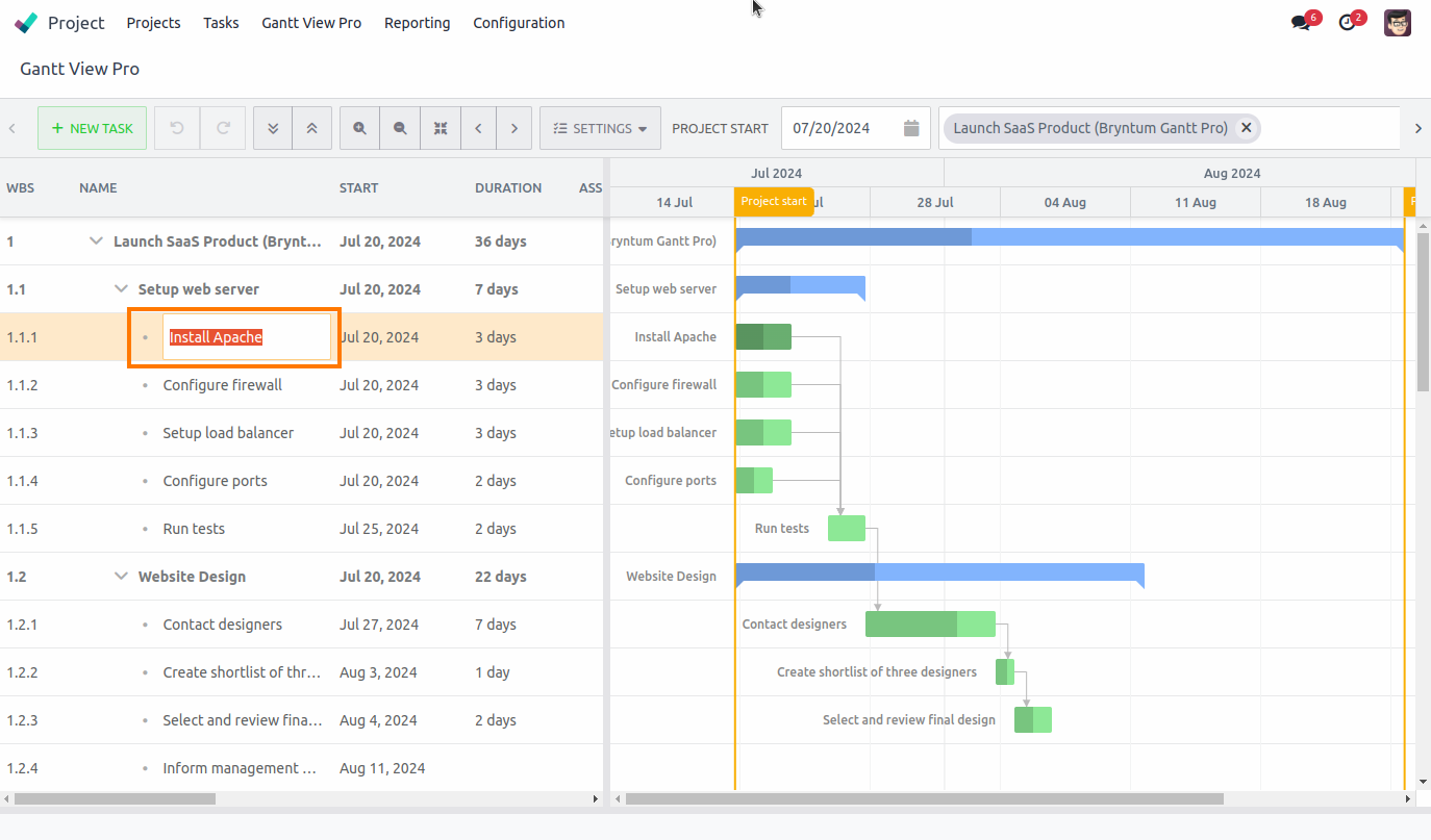
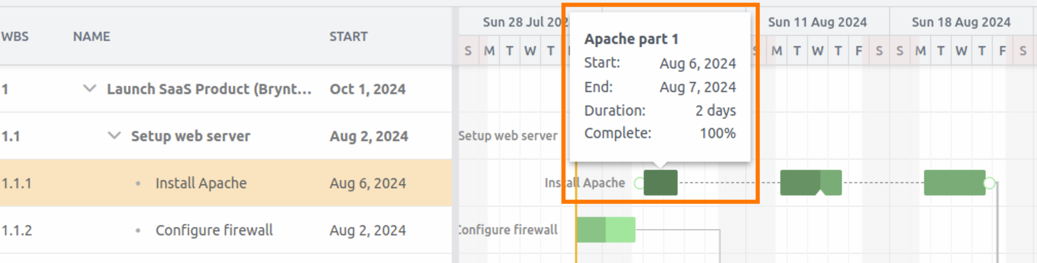
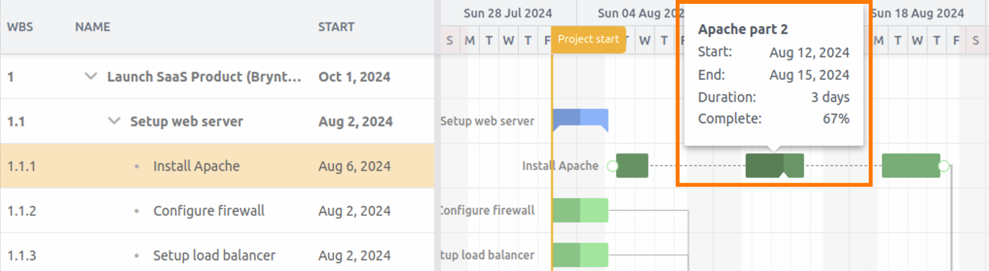
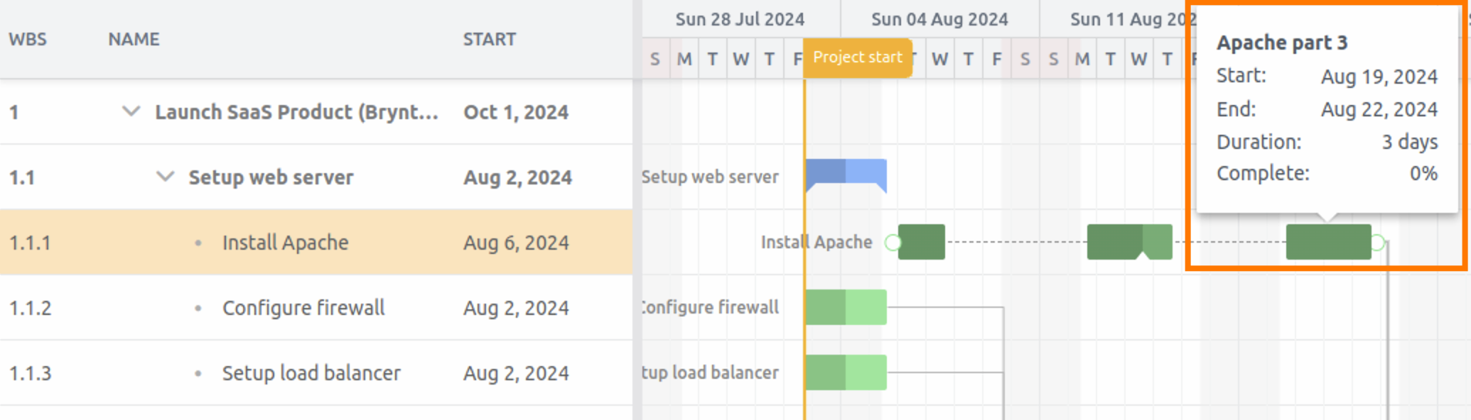
7.8 Rename
You can rename each section of a split task to what it needs to be within the task. The name will pop-up when you hover over the section. The dashed line will display the task name when hovering over it, reminding you of which task the section is a part of.
8. Double-click options
Double-clicking on any task in the timeline opens a new window that displays five tabs, each containing different aspects of information and options for the task. The 'Edit' option when right-clicking on a task in the grid takes you to the same view.
Let's cover all options and functions per tab, going from left to right.
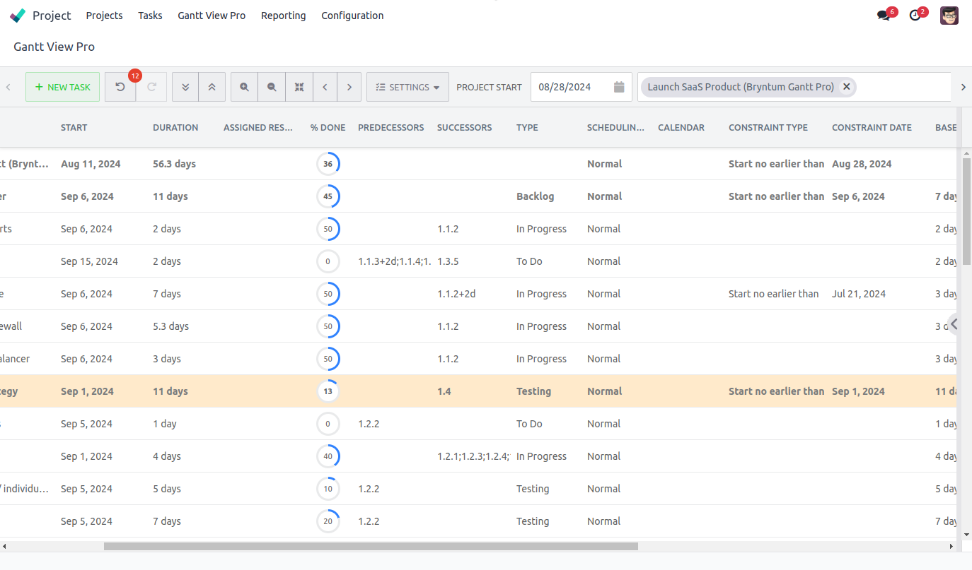
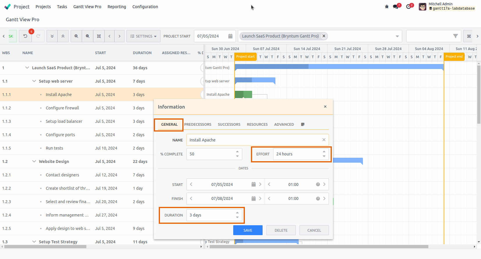
8.1 General tab
The general tab shows all basic information of a task.
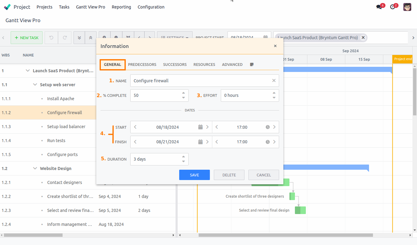
8.1.1 Name:
Displays the name of the task, which you can adjust if needed.
8.1.2 % complete
Shows the percentage at which the task is complete. Currently, this needs to be operated manually. But the goal is to have Timesheets linked to it from the backend, so when an assigned resource writes time, the percentage will automatically update, too. This will become available in a future release.
8.1.3 Effort
This offers the alternative to use hours instead of days (Duration) to show how much time is needed for a task. It comes into play with options available in the Advanced tab: See the Scheduling mode and Effort driven sections.
8.1.4 Start/Finish date
Here you can set a start- and finish date for tasks. For instance, when changes occur in the timeline. This is an alternative to dragging a task forward or backward in the timeline, or adjusting the length of a task.
8.1.5 Duration
Shows the length of a task in days. The length of the days are determined by the calendar you pick. The default of the Gantt is 24 hours. It can be adjusted here, if needed, too. Duration becomes more important with options available in the Advanced tab: See the Scheduling mode and Effort driven sections for more information.
8.2 Predecessors tab
The predecessors tab shows which tasks precede the selected task. Usually, it indicates which tasks either depend on, or need to be finished before, the current task can get started on.
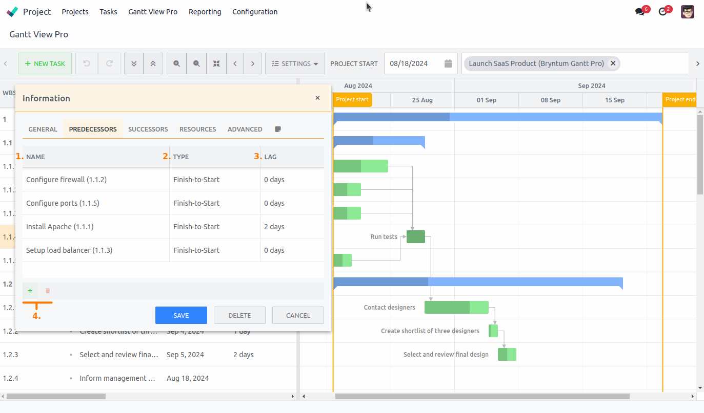
8.2.1 Name
Shows you the names of tasks that precede the task you've selected.
In this case the task 'Run tests' has been selected. The four names in the Predecessors tab are the ones above it, visually represented by the dependency lines and ending in the arrow pointing to 'Run tests'.
8.2.2 Type
This shows the type of dependency the task has to the current task that's selected. Finish to Start is the default, but there are four options in total to choose from:
- Start to Start; start that task to start this task.
- Start to Finish; start that task to finish this task.
- Finish to Start; finish that task to start this task.
- Finish to Finish; finish that task to finish this task.
8.2.3 Lag
Allows you to to set a lag for the task in relation to the selected task.
It might be that that task needs to start 2 days before the selected task, in which case you set it to -2 days. If it needs to start 2 days after, you set it to 2. The option you've selected in the Type column can play a role in what will be a logical lag option. If no lag is needed, leave it at 0.
8.2.4 Add/Delete predecessors
Drawing dependencies is one way to indicate which tasks precede another (See the Draw dependencies section for more information).
The other way is to add or delete them here, as predecessors. If none are set, or you need to add a task as predecessor, you can do it here by clicking the '+' sign. You can select all available tasks that will appear in the highlighted field in the 'Name' column.
If a predecessor, or dependency, is no longer needed, select one, or more using Ctrl, from the list and hit the trash can icon. The selected tasks will be deleted and the dependency line will disappear.
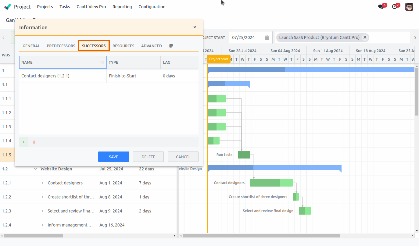
8.3 Successors tab
The successors tab shows which tasks succeed the selected task and works exactly the same as the Predecessors tab. It usually indicates that the current task needs to be finished before the succeeding tasks can get started on, or shows which tasks depend on the current task.
For example, in the screenshot below, 'Run tests' has been selected. From the successors tab you can see that the task 'Contact designers' is the next one in line after the tests have been completed. This is also visible in the Gantt View by the dependency line going from 'Run tests' to 'Contact designers'.
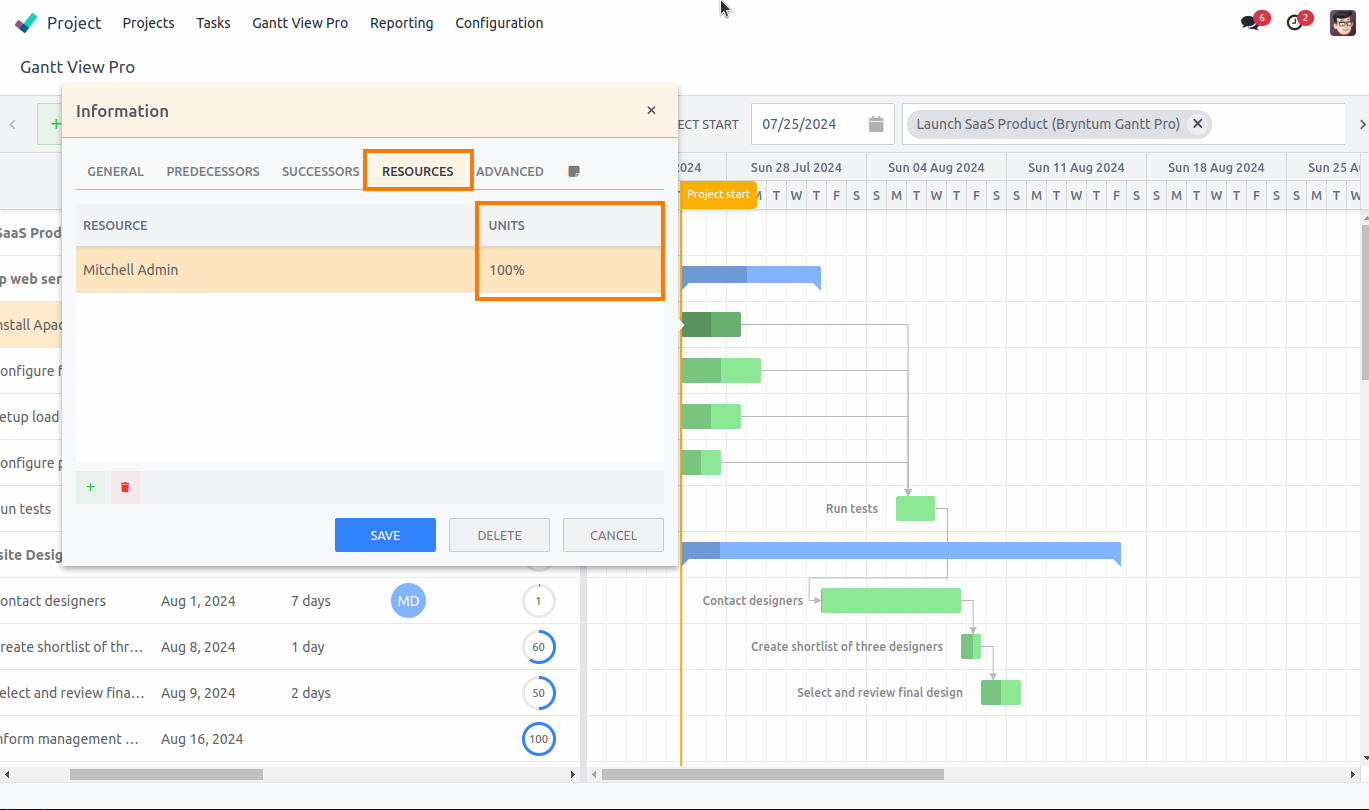
8.4 Resources tab
The resources tab shows which resources are assigned to a task, or allows you to set them, if none have been selected yet.
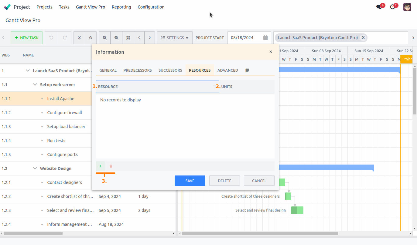
8.4.1 Resource
Displays the name of the resources needed for this task. This can be people, but also rooms, equipment, tools, cars, locations, etc.
8.4.2 Units
Shows the amount of units (time) percentage that a resource will dedicate to the task. If it's one person, than most likely the unit percentage is 100. If it's 4 people, it can be 25, each. You can set these manually and decide how the units are divided over the selected resources.
8.4.3 Add/Delete
The '+' and trash can icons allow you to add or delete resources the same way you do with predecessors and successors. Clicking '+' will highlight the first available row in the Resource column and allow you to select from the available resources, which will become visible in the highlighted field.
If a resource is no longer needed, select one, or more using Ctrl, from the list and hit the trash can icon. The selected resources will be deleted from the list.
8.5 Advanced tab
The advanced tab shows all the advanced features available for a task. Some affect solely the current task, while others affect the current task and the ones that depend on it, changing the planning of the Gantt view.
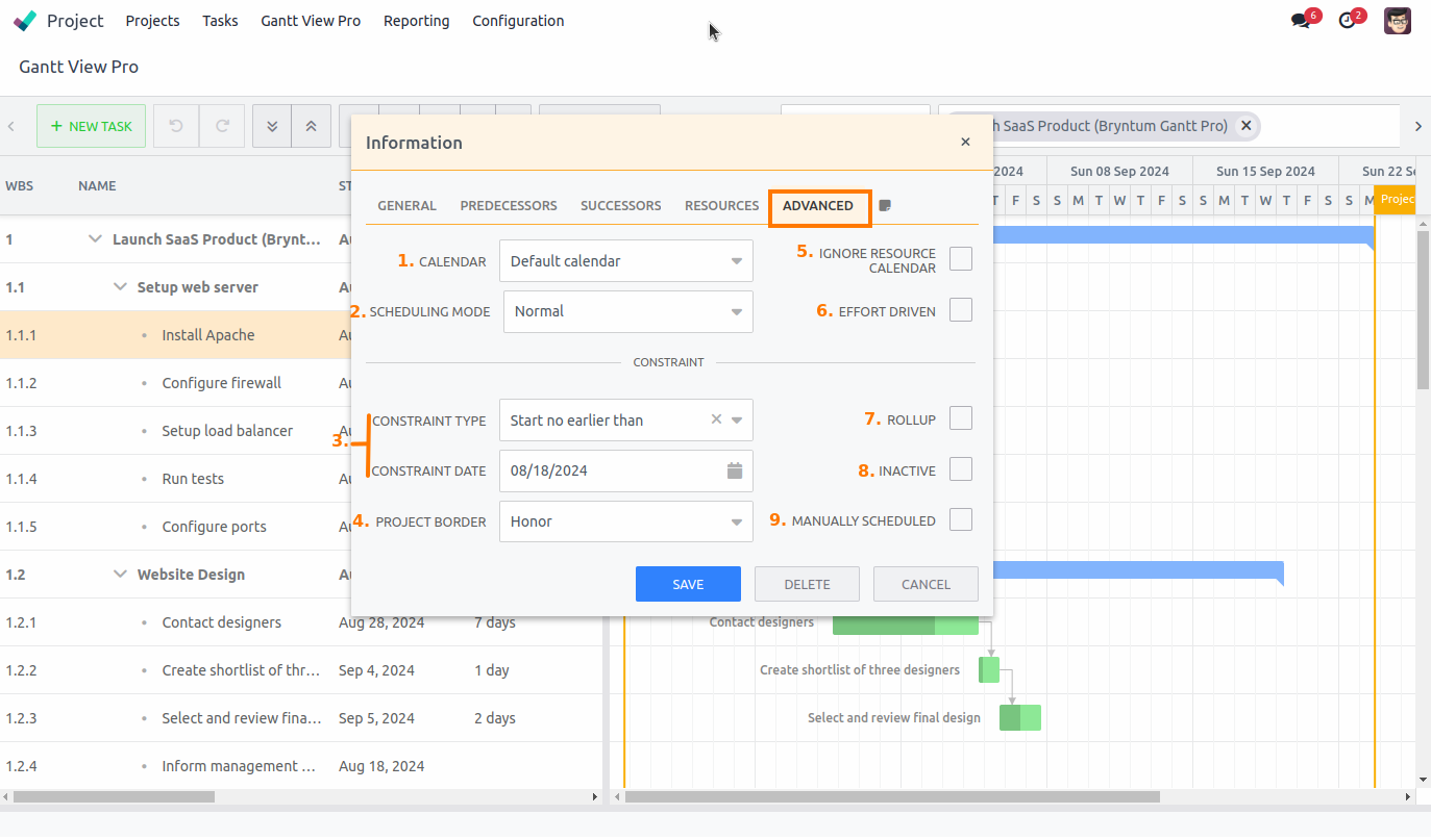
8.5.1 Calendar
You can pick a calendar here that is customized to the task, ignoring the global calendar settings. There are seven calendars to choose from.
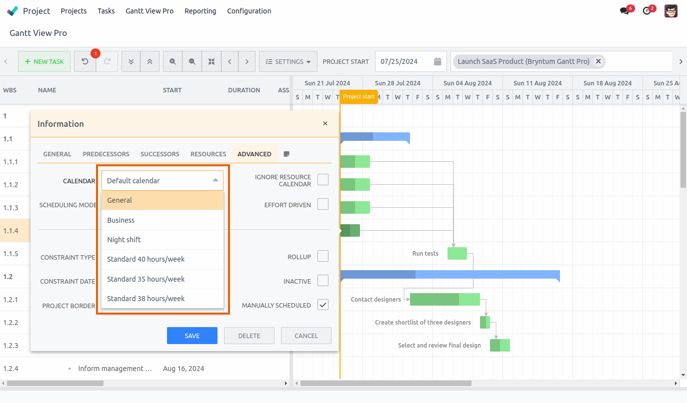
- Default calendar: This is the calendar that is selected by default. It uses the calendar that is selected under Configuration - Settings - Gantt View Pro - Default Calendar (For details, see the Default Calendar section).
- General: This calendar uses 24 hours per day, Monday to Sunday.
- Business: This calendar uses business hours, 9:00 to 17:00, Monday to Friday.
- Night shift: This calendar uses 12 hours per day, 19:00 to 7:00, Monday to Sunday.
- Standard 40 hours/week: This calendar uses a standard 40 hour week, Monday to Friday.
- Standard 35 hours/week: This calendar uses a standard 35 hour week, Monday to Friday.
- Standard 38 hours/week: This calendar uses a standard 38 hour week, Monday to Friday.
8.5.2 Scheduling mode
There are four modes to pick from, each allowing different scheduling modes to occur. *Note that the modes work closely together with 'Effort driven' to the right of it. All, except 'Normal', need 'Effort driven' checked to work.
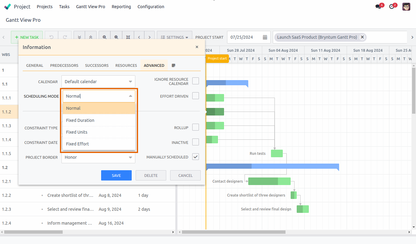 The four modes are:
- Normal
- Fixed Units
- Fixed Duration
- Fixed Effort
The Effort driven section below gives a more in depth explanation about these four modes and what they do.
8.5.3 Constraint type and date
Constraint type: Allows you to pick a restraint applicable to the task. There are 9 options. Let's go over them below.
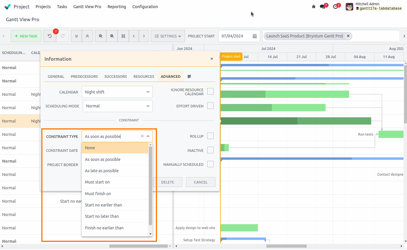
- None: No constraint will be used.
- As soon as possible --> The task will be scheduled to finish as soon as possible.
- As late as possible --> The task will be scheduled to finish as late as possible.
- Must start on --> The task must start on the date set in Constraint date.
- Must finish on --> The task must finish on the date set in Constraint date.
- Start no earlier than --> The task must start no earlier than the date set in Constraint date.
- Start no later than --> The task must start no later than the date set in Constraint date.
- Finish no earlier than --> The task must finish no earlier than the date set in Constraint date.
- Finish no later than --> The task must finish no later than the date set in Constraint date.
Constraint date: Allows you to set a date for options that mention it, picked in Constraint type field described above.
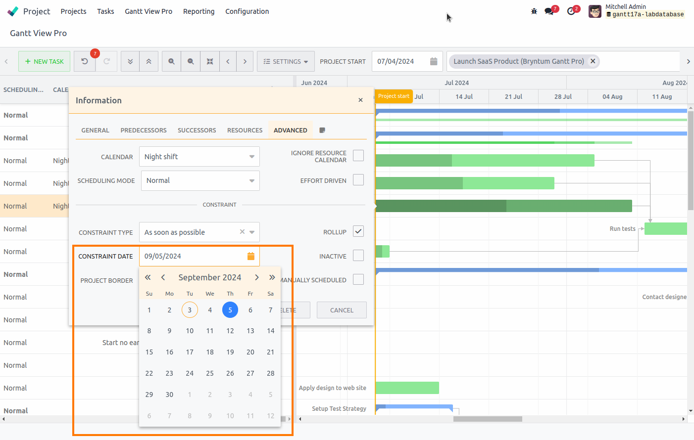
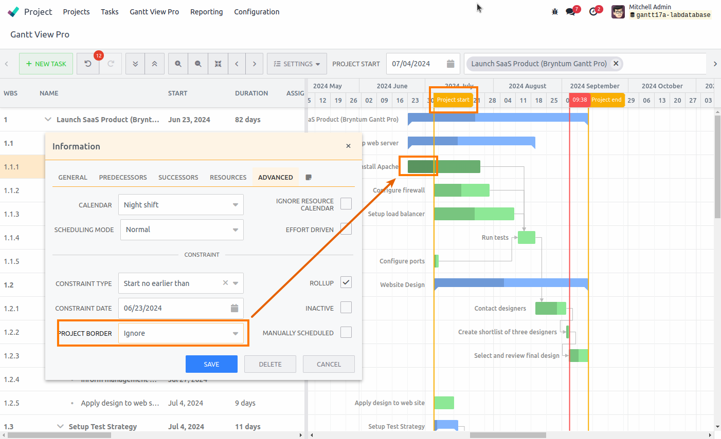
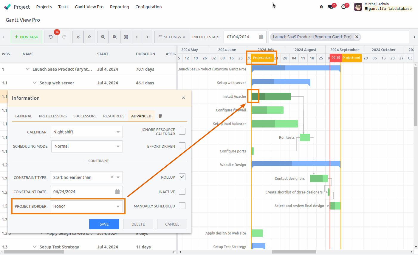
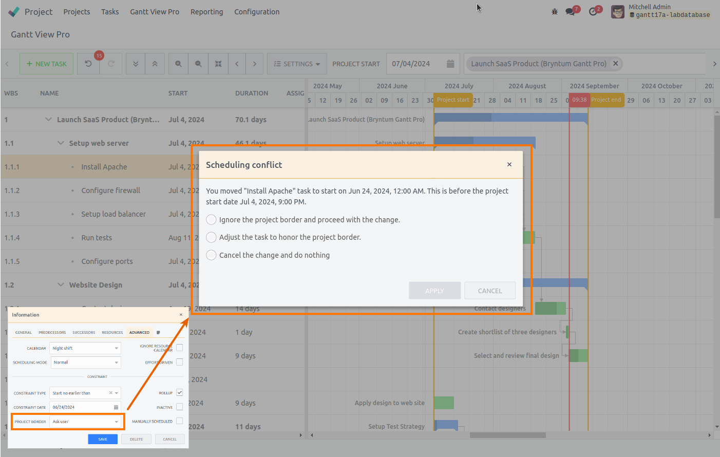
8.5.4 Project border
In this field there are three options to choose from, Ignore, Honor, and Ask user. They allow you to decide whether a task should honor, ignore, or ask you to go over the project start-date (the border) or not. Let's go over them below. *Note that the 'Manually scheduled' option needs be unchecked for project border to work.
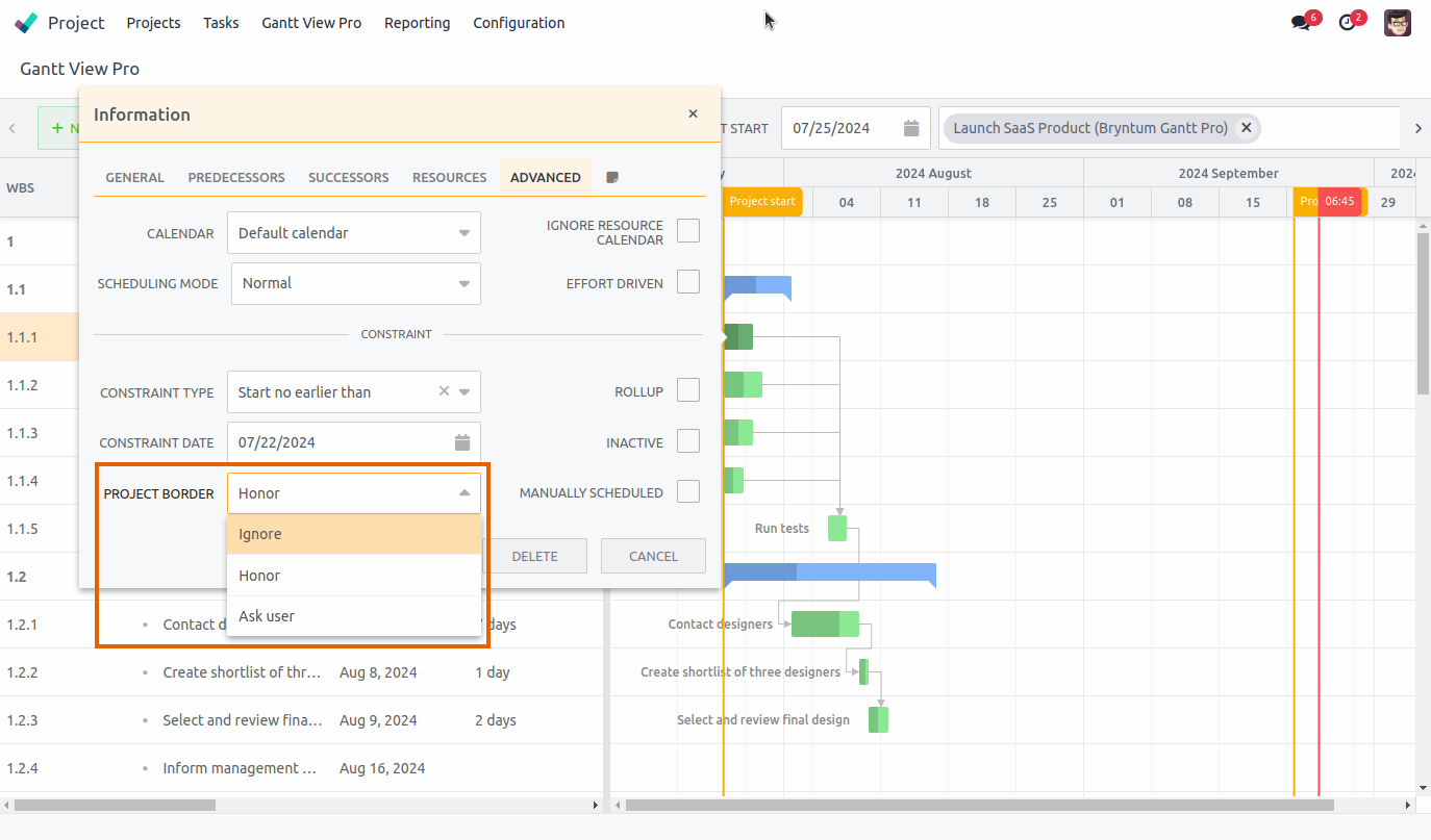
-
Ignore: Selecting this option allows you to drag a task past the start-date line and it will stay where you move it.
-
Honor: Selecting this option will put a task back inside the project start-date line when you try to move it outside of it.
-
Ask user: Selecting this option, a pop-up will appear when you move a task past the project-start date asking you what you want to do. You can either ignore, honor, or cancel the move. The choice you make will adjust the Project border to it, i.e. picking ignore, will set project border to Ignore.
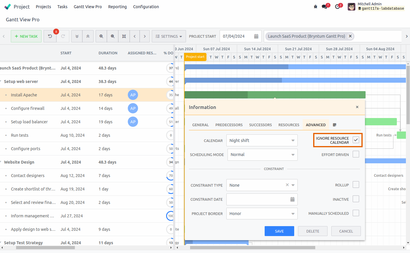
8.5.5 Ignore resource calendar
When this box is checked, the calendars of the assigned resources are not taken into account when scheduling the task. It allows you to assign more time to a resource than is available to them. The three screenshots below show the results of checking the box.
8.5.6 Effort driven
Checking the Effort driven box takes the schedule selected in Scheduling mode into effect.
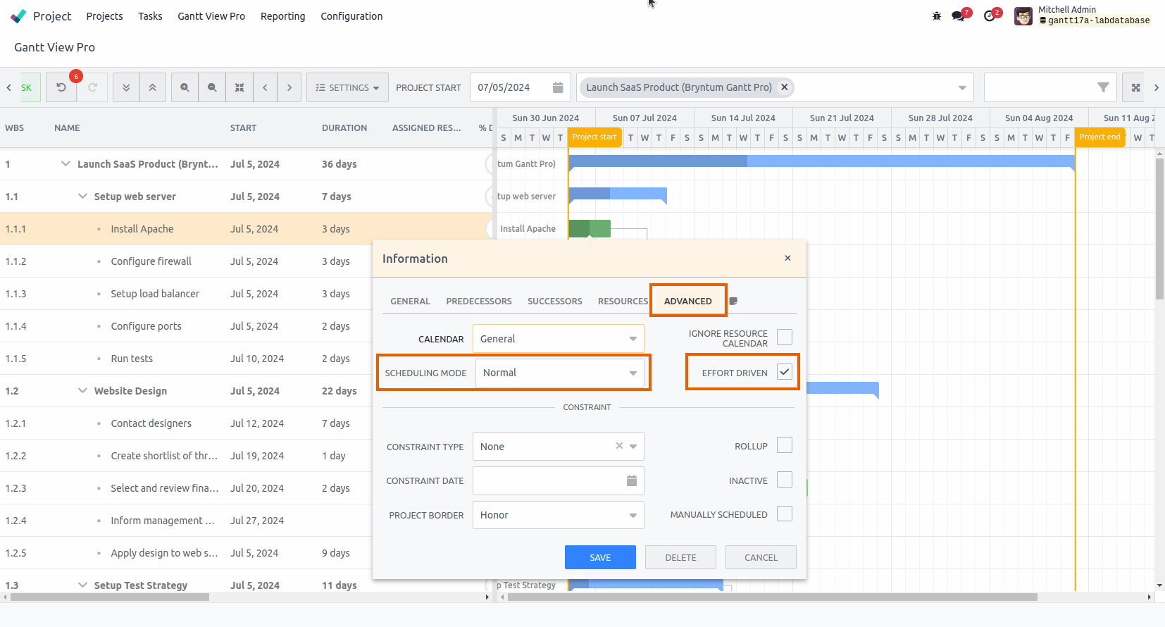
- Normal: You can adjust ‘Duration’, ‘Effort’ and 'Units' under the General and Resources tabs separate from one another. Changing one, won't affect the others.
- Fixed Units: 'Effort' and ‘Duration’ can be updated under the General tab, but will not affect the 'Units' under the Resources tab.
- Fixed Duration: ‘Duration’ remains the same when you adjust ‘Effort’, under the General tab, or 'Units', under the Resources tab. See image under number 4, below.
- Fixed Effort: ‘Effort’ remains the same when you adjust ‘Duration’, under the General tab, or 'Units', under the Resources tab.
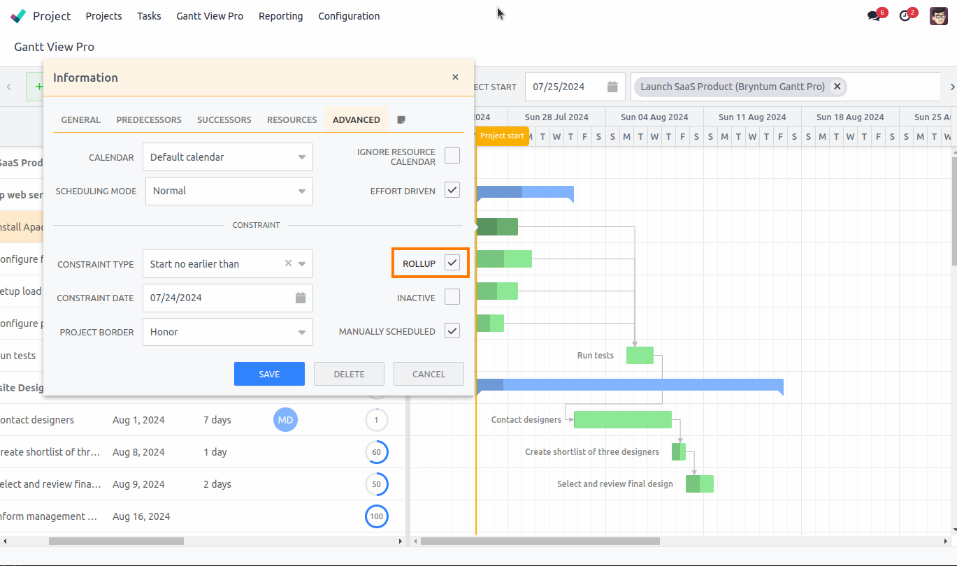
8.5.7 Rollup
Rollup shows a summary of the task, or tasks if the timeline overlaps, underneath the parent task above. Checking the Rollup box will make all options described under the Show rollups section available in the timeline view.
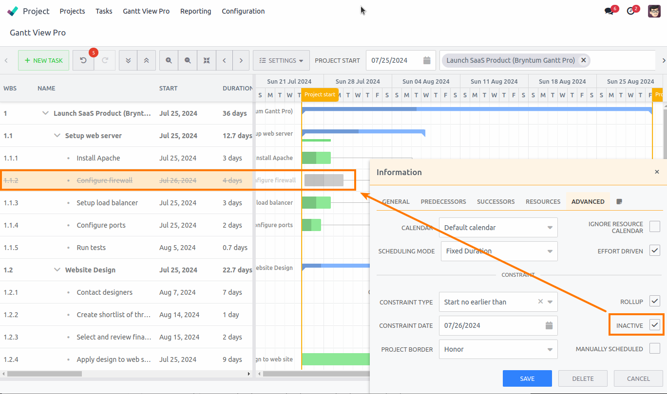
8.5.8 Inactive
Allows you to make a task inactive in the Gantt. The task will show up as grayed-out in the timeline. In the grid, the column data for that task will show as strikethrough and grayed-out.
8.5.9 Manually scheduled
When this is selected, the Start Date of the task will not be changed by any of its incoming dependencies or constraints, allowing you to drag the task anywhere in the timeline.
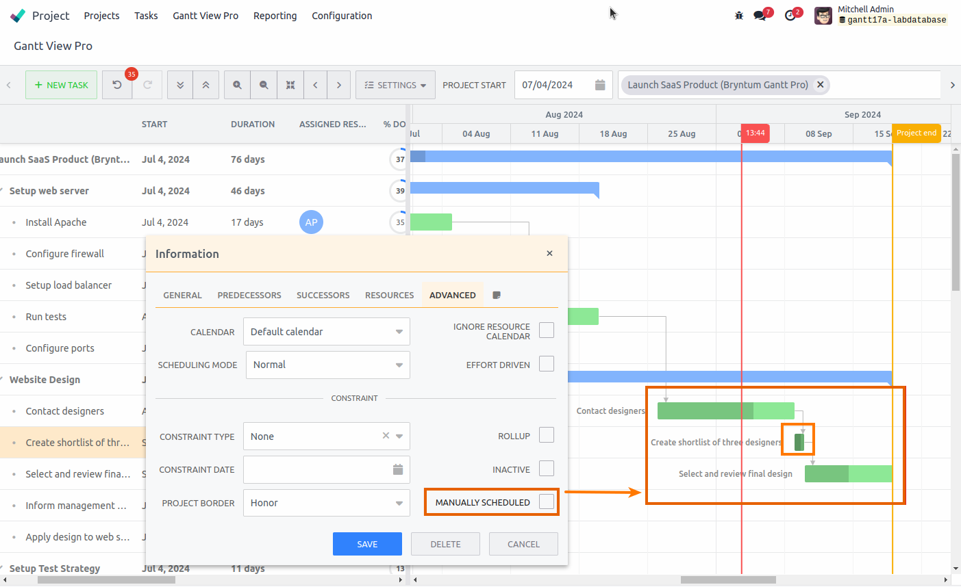
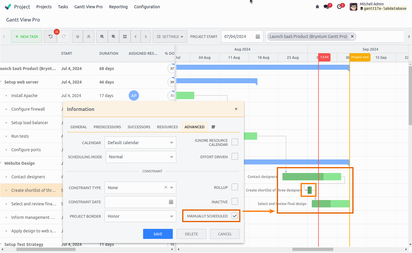
Keep in mind that some options, like Effort driven and Auto-scheduling, might also be affected by checking Manually scheduled.
Copyright - 2024 - Bryntum